Diabetes Prevention

Background
In this project, the objective was to craft a compelling set of branding elements or campaign deliverables focused on advocacy for public welfare issues. After an extensive evaluation of numerous subjects, I chose to concentrate on diabetes prevention, making it the cornerstone of my thesis.
Statistical Background:
**Diabetes has reached alarming proportions on a global scale:**
- An estimated 415 million people worldwide were afflicted with diabetes as of 2015. Within the United States
- 30 million people live with diabetes, and an additional 1.7 million are diagnosed annually.
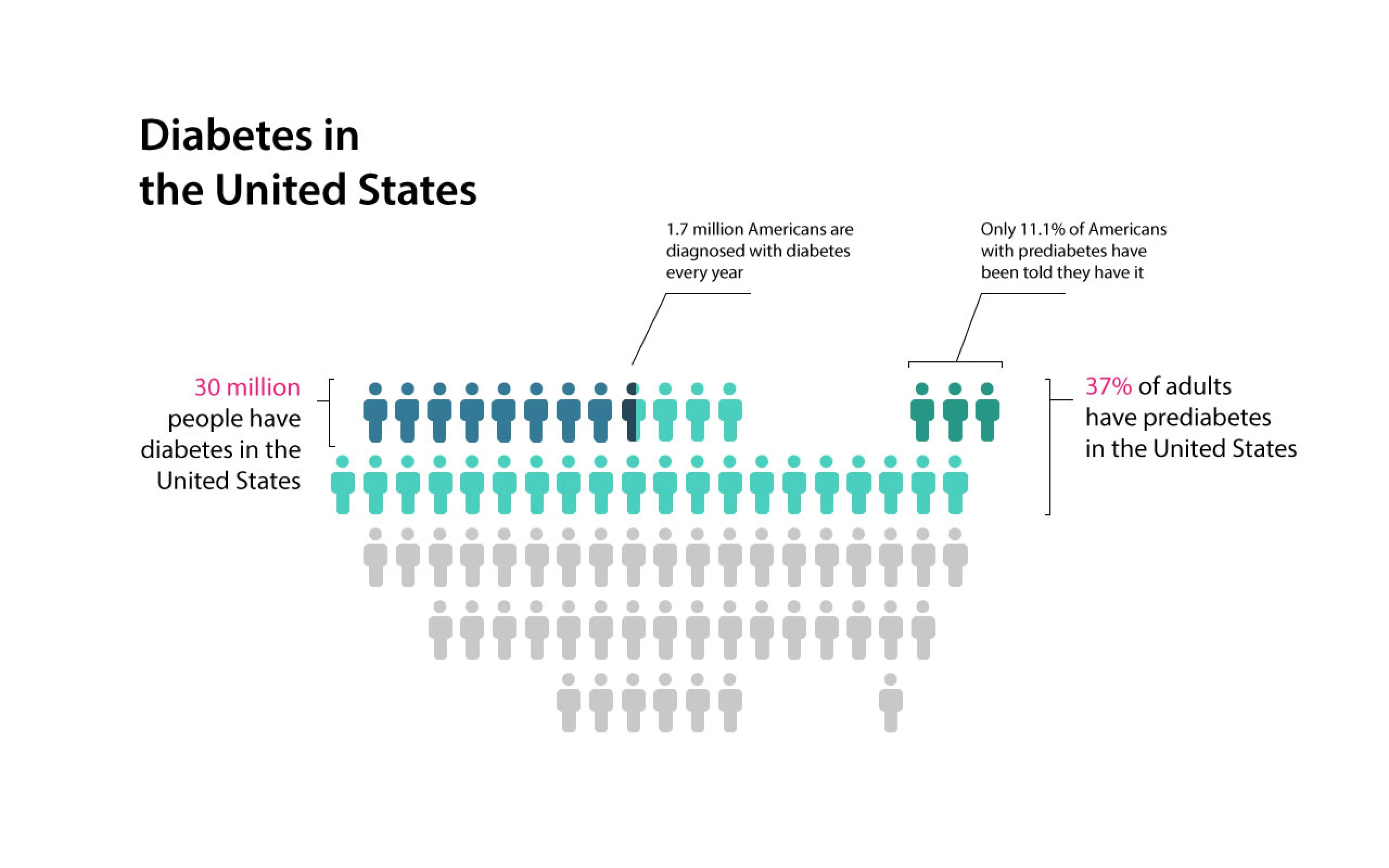
Diabetes distribution in United States' population 2015
**The situation becomes even more concerning when considering prediabetes:**
A staggering 37% of U.S. adults aged 20 and above have prediabetes, yet only a mere 11.1% are aware of their condition.
**Mortality:**
Annually, diabetes is the primary cause of death for 69,071 Americans and contributes to a total of 234,051 deaths, factoring in both primary and contributory causes.
This wealth of data underscored the urgent need for an effective branding campaign aimed at diabetes prevention, thus solidifying the focus of my academic project.
Research
In the research phase of the project, I delved into understanding the complexities of Diabetes Mellitus, commonly known as diabetes. This metabolic disorder is characterized by prolonged high blood sugar levels, causing symptoms like frequent urination, increased thirst, and hunger. Without proper management, diabetes can lead to acute complications such as diabetic ketoacidosis, coma, and even death. Long-term complications may include heart diseases, strokes, kidney failure, foot ulcers, and eye damage.
Key Issues:
- The prevalence of diabetes in the United States surpasses the global average.
- There is a concerning lack of awareness about diabetes in U.S. society.
- Currently, no cure exists for either type 1 or type 2 diabetes.
- Prevention of diabetes is possible only through lifestyle and behavioral changes.
Strategic Focus:
Given these critical issues, I determined that the most impactful approach for public advocacy would be to focus on elevating diabetes awareness and guiding preventive measures.
Organizational Framework:
To bring this vision to life, I conceptualized an entity called the Diabetes Prevention Organization. This hypothetical organization aims to raise awareness about diabetes and offer preventive solutions. To better align my project with real-world initiatives, I researched activities conducted by existing organizations in this field. Consequently, my organization would offer the following services:
For the General Public:
- Diabetes prevention open houses
- Community events focused on diabetes prevention
- Diabetes screening tests
- Volunteer engagement programs
For Individuals with Diabetes:
- Long-term wellness programs
- hort-term educational camps
- Consultations with diabetes experts

Logo Design
In design phase, I started with the logo. Because diabetes awareness is one of the design directions, therefore the logo should have a very strong visual relationship with the diabetes. I researched icons and visual representation of diabetes. There are several symbols related to the diabetes shows in result: blood drop (represent blood test), red cross symbol (represent health care), blue circle (universal diabetes symbol), the plus symbol (represent urine test result).
Paper sketchs:
I started with paper sketchs playing with those symbols
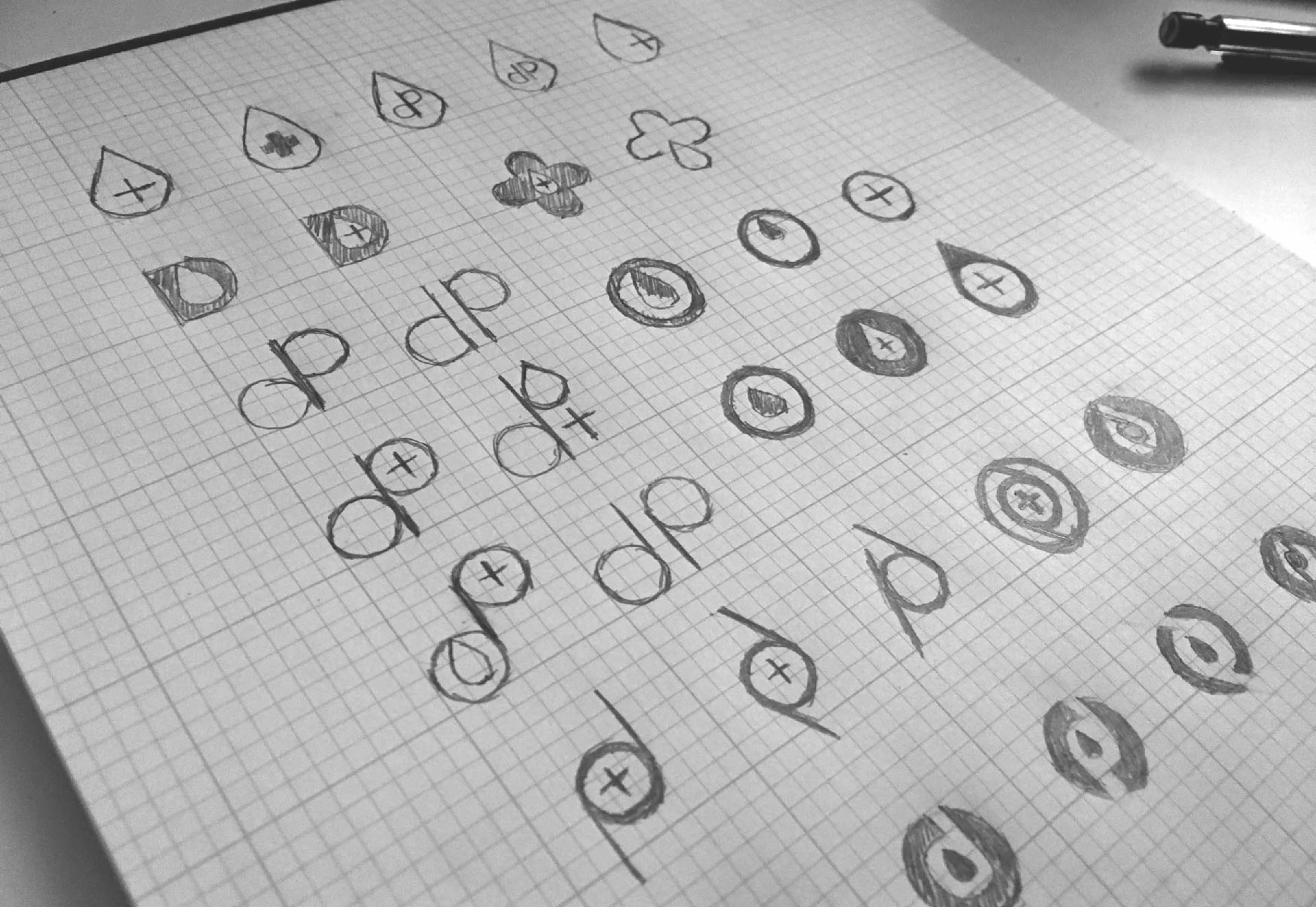
Paper sketchs
Final Approach:
After several round of test and improvement, I decided the final version. I use blue circle as my main element because of the diabetes’ universal blue circle symbol. The negative space is combining blood drop and letter “d” together.
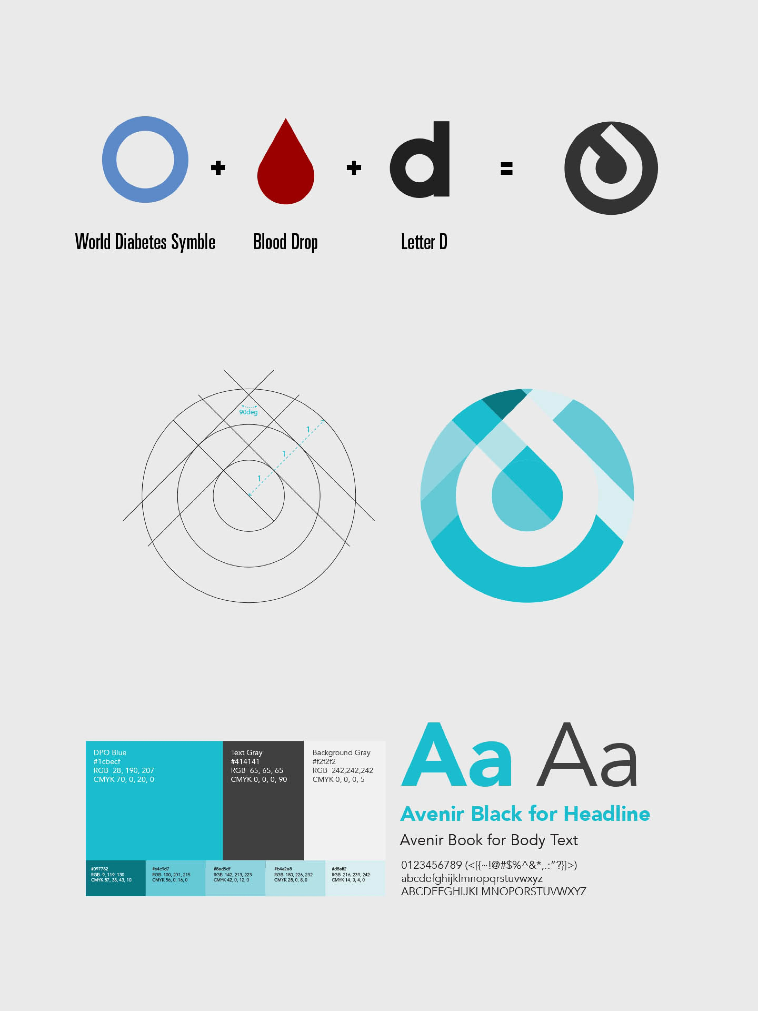
Final approach
Tonal Variations:
Because diabetes are preventable and I also want the logo to express an active attitude, therefore, I changed the hue level of the blue from its original cornflower blue to curious blue, and also increased the saturation level and brightness level a little bit.

In the full-tone version of the logo, varying brightness levels of the blue are used to indicate different glucose test results. This design choice serves a dual purpose: not only does it underline the organization's inclusive mission to aid everyone affected by diabetes, regardless of their blood or urine sugar levels, but it also adds a dynamic visual element to the logo. This nuanced use of color imbues the logo with a sense of depth and movement, making it visually engaging while staying true to its symbolic roots.
Application
Stationery
For the stationery, I emphasized the logo as the central visual element to tie it back to the core mission of diabetes awareness and prevention. Given the broad target audience—which includes nearly a third of the U.S. population falling into the prediabetes category—I aimed for a clean, attention-grabbing aesthetic. Consequently, I minimized text and maximized the use of the brand's color scheme. The background prominently features the branding color, setting the stage for the logo to occupy the highest level of visual hierarchy.

Stationery Design
Website
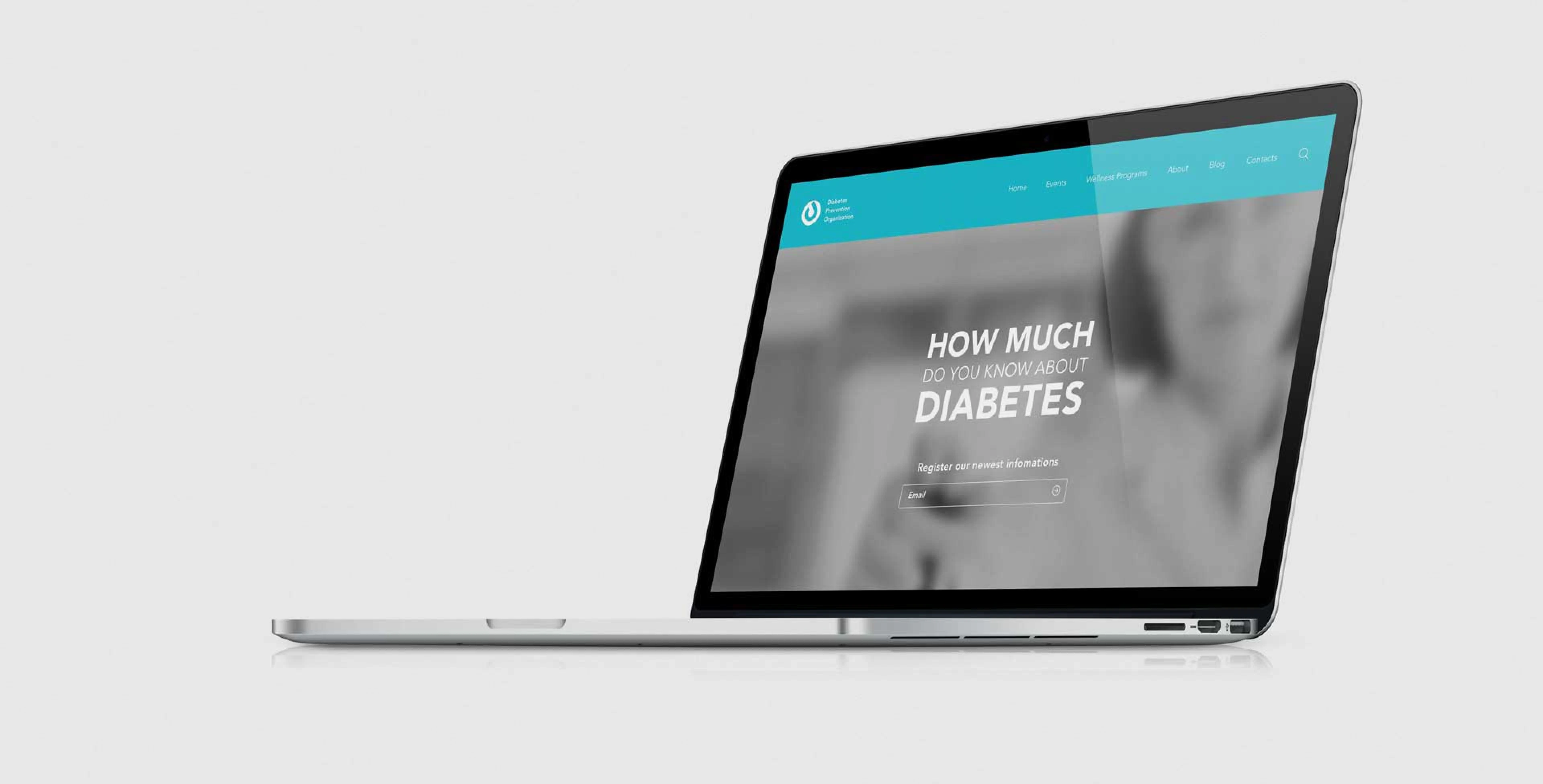
Transitioning to the website, I utilized the visual language established in the logo and stationery to ensure a cohesive brand identity. I kicked off the process by outlining several drafts of the sitemap, keeping in mind the comprehensive business scope of the Diabetes Prevention Organization. This was followed by preliminary wireframes that helped refine the site's architecture. The culmination of this phase was the final high-fidelity homepage, which serves as a harmonious blend of visual consistency and functional design, aimed at engaging users and delivering essential information efficiently.
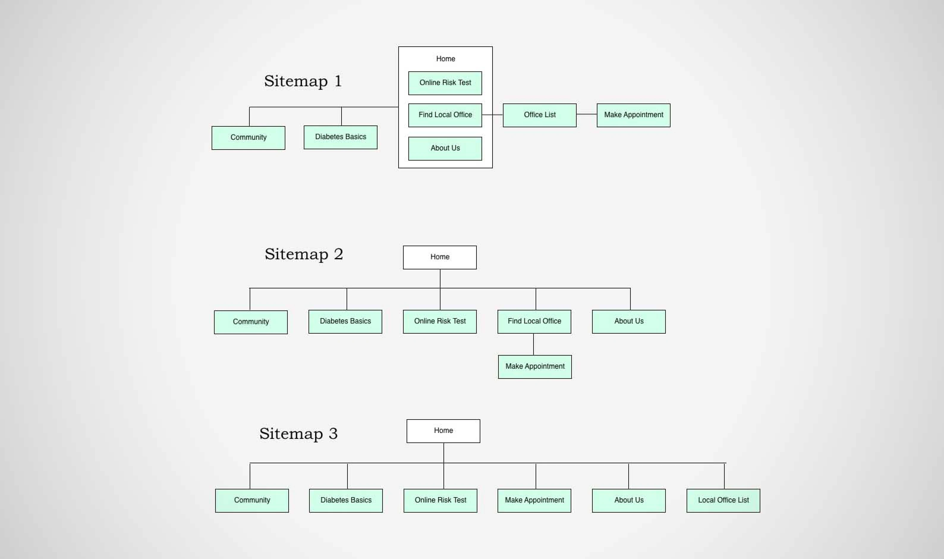
Sitemap
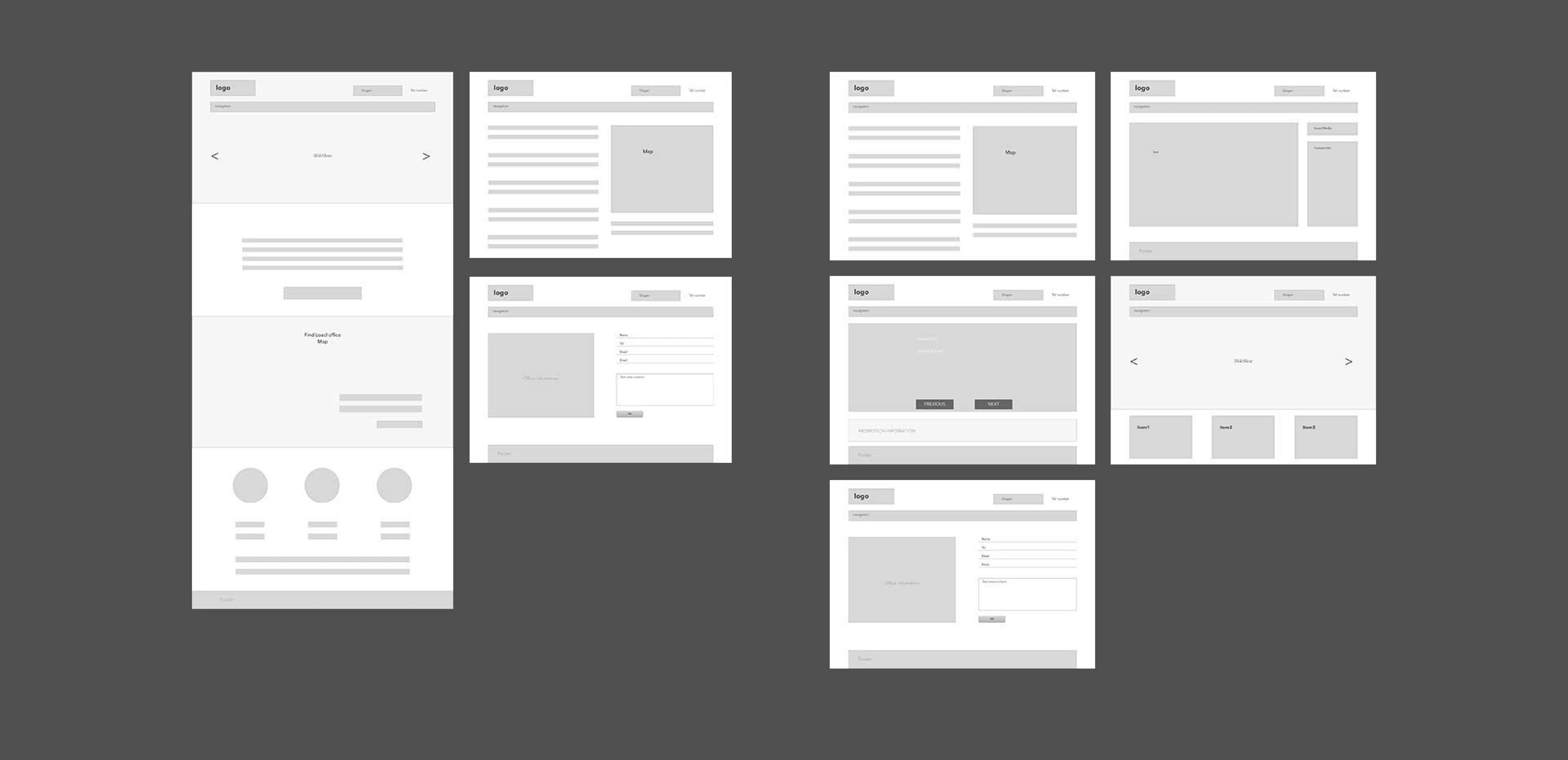
Wireframes

Web Design
Additional Applications:
In addition to the primary branding elements, I also developed supplementary applications to extend the reach of the brand. Each application was carefully designed to align with the established brand identity, ensuring a cohesive and effective brand message across various platforms.
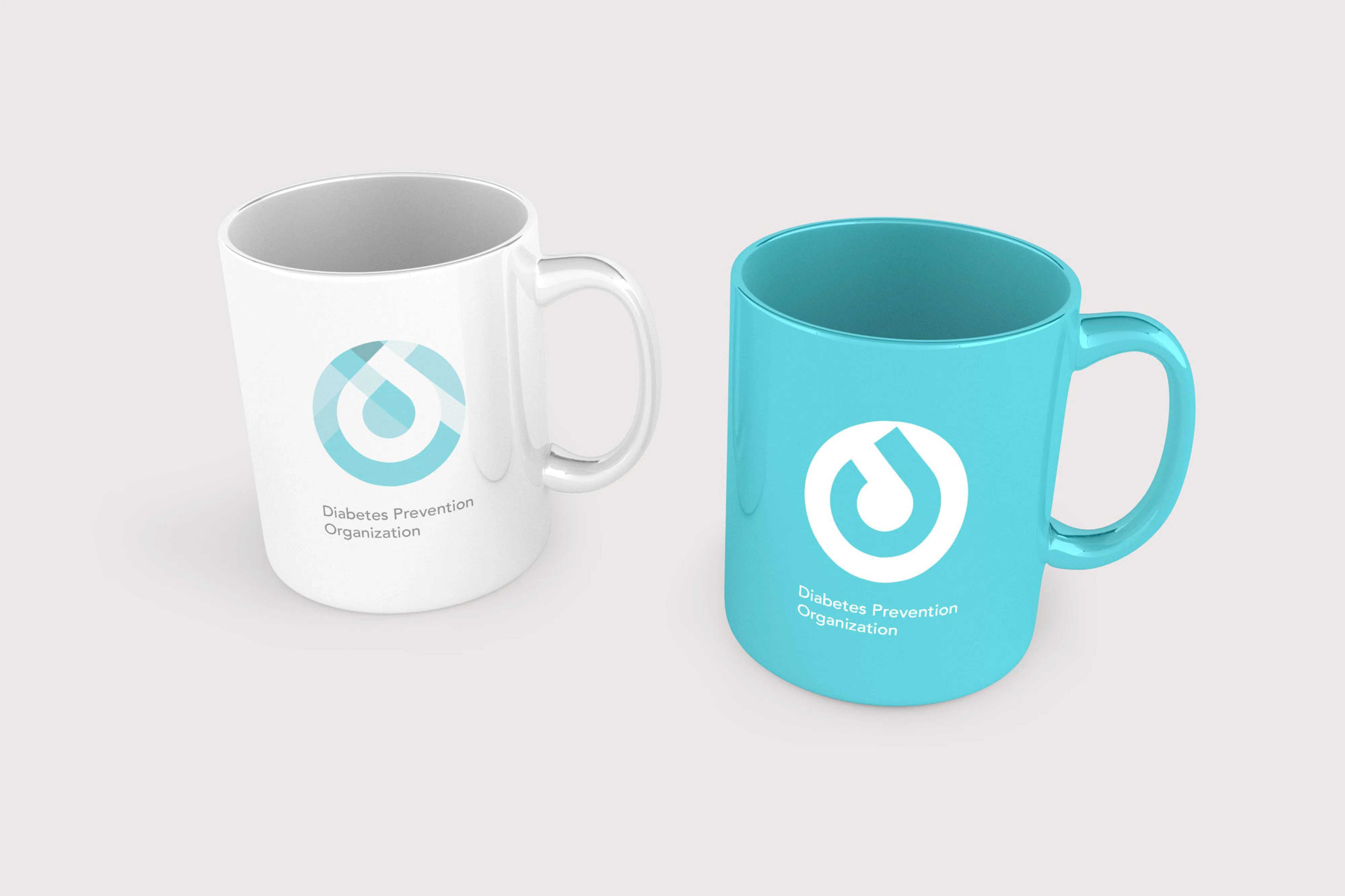
Mugs
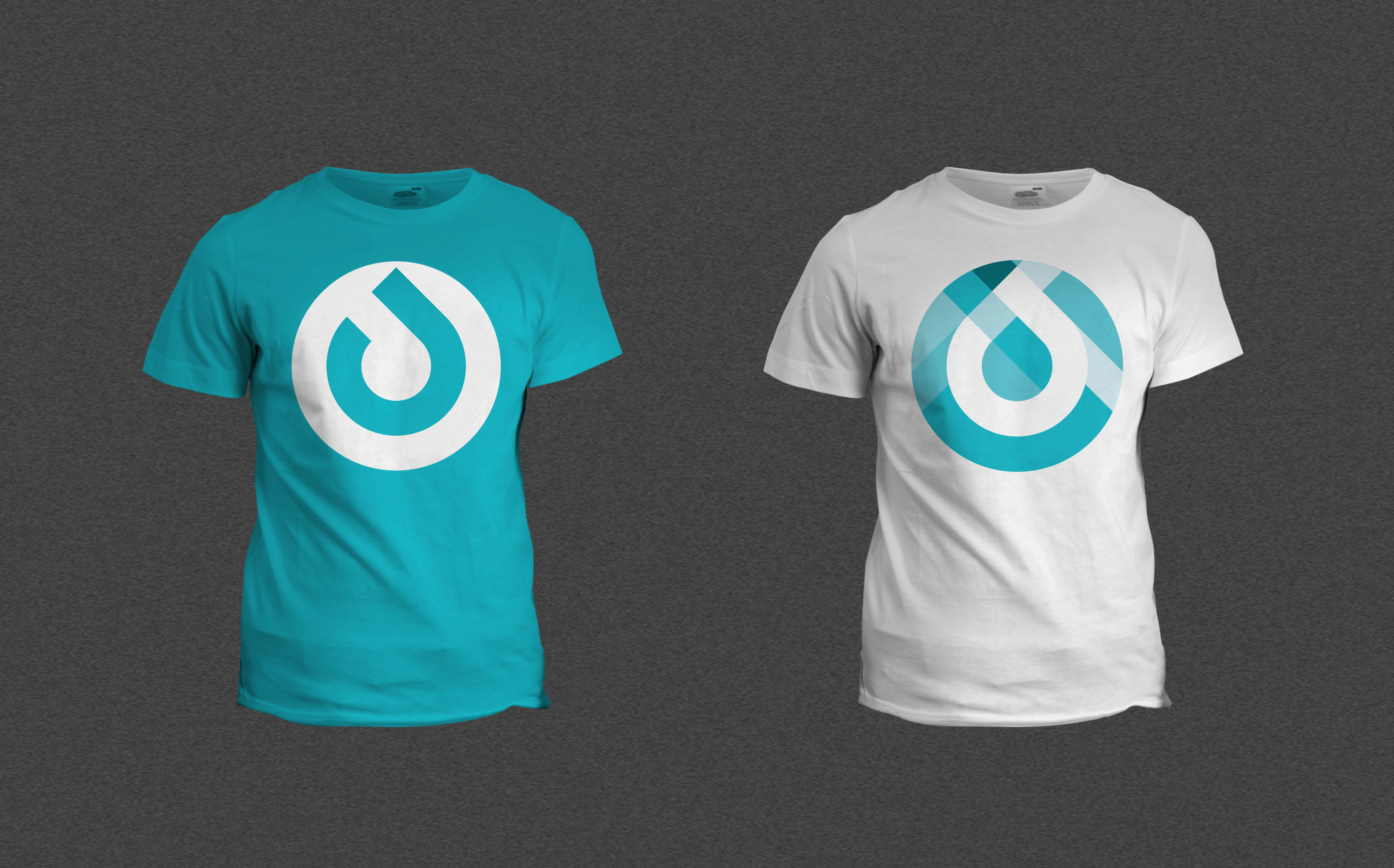
T-shirts

Bags
Learning
This project was an enriching experience in understanding the depth and breadth of branding as a design discipline. I learned the importance of visual coherence and narrative strength in building an impactful brand identity. Crafting each component, from the logo to the website, taught me how to translate a conceptual foundation into a multi-faceted, engaging visual language that resonates with a diverse audience. This has been a valuable addition to my skill set as a UX/UI designer, offering me a holistic view of design's role in public advocacy.