Sports Illustrated Web
Strategically Streamlined - An Innovative Redesign Journey
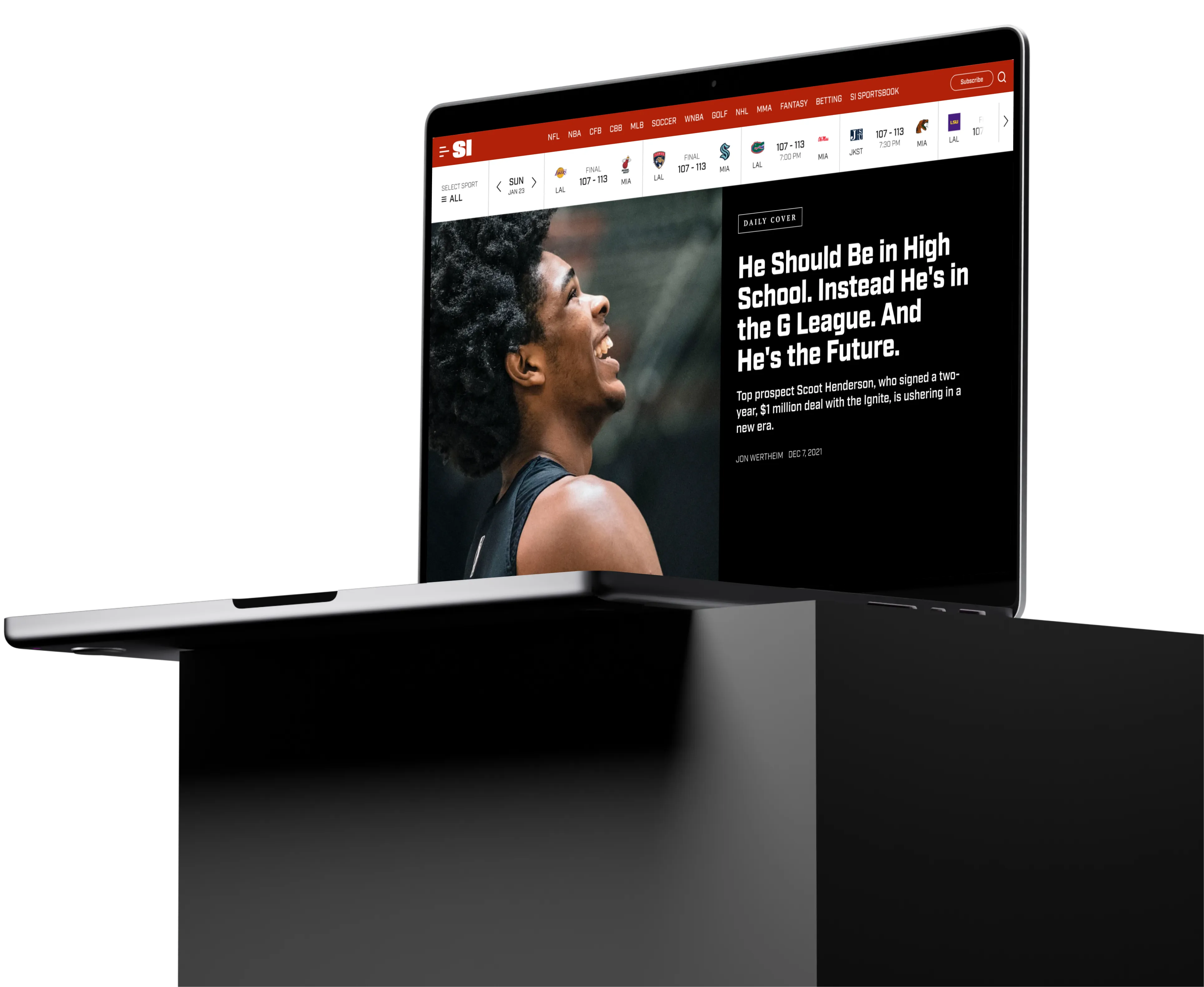
Introduction
Role and Collaboration
In the grand mosaic of the Sports Illustrated website revamp, I found my niche as a pivotal UX designer. My journey was characterized by close-knit collaborations with a dynamic ensemble of professionals—developers, product managers, and fellow designers. Together, we navigated the intricate intricacies of web redesign, each bringing our unique expertise to the table.
Evolution of Responsibilitie
As the project progressed, so did the scope of my responsibilities. What began as focused design tasks eventually blossomed into an expansive role. I was entrusted with crafting pivotal design elements that would shape the new face of the SI website. From detailed style sheets to comprehensive design guidelines, I played a crucial role in weaving the visual tapestry of the website. Moreover, I introduced a fresh visual vocabulary, bringing contemporary flair to the Sports Illustrated web experience.
Consistency and Coordination
The multi-year timeline of this project posed unique challenges, chiefly ensuring that the design remained consistent, even as we regularly integrated new features. This required an agile approach and meticulous attention to detail. Beyond design, the essence of our success lay in open channels of communication. Regular dialogues with diverse stakeholders ensured that our visions aligned, and we delivered a cohesive and intuitive user experience.
Key Components Redesign
Homepage: Flexibility Meets User Engagement
As the digital front door to the Sports Illustrated experience, the homepage serves a pivotal role. It's not just about presenting content but doing so in a way that captivates, informs, and drives engagement. To cater to the diverse needs and dynamic nature of the SI audience, two primary templates were designed, ensuring adaptability while maintaining a cohesive brand experience.
**Full Bleed Hero Section for Daily Covers:**
In the dynamic realm of sports journalism, some narratives rise above the regular, encapsulating moments that resonate deeply with the audience. The Full Bleed Hero Section was crafted to spotlight these tales. Encompassing the entire viewport, this design template prominently showcases the daily cover, placing the day's most newsworthy or evocative article in an unmissable position. Beyond singular events, this section also has the flexibility to feature a collective series of in-depth stories, especially tailored for extended coverage on special events or overarching themes. It's not just about creating a strong visual impact; it's a deliberate strategy to draw users into multi-layered narratives, ensuring they immerse themselves in the richness of the content.
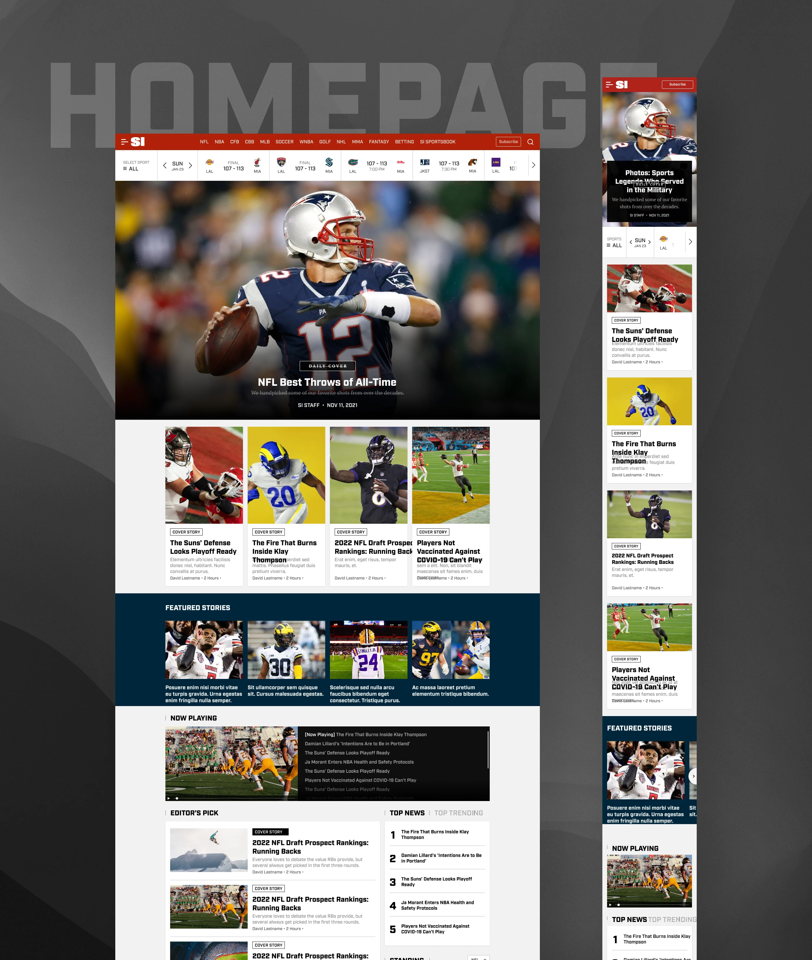
Full Bleed Hero Template
**General Content Stream for Daily Consumption:**
While major stories command the limelight, the continuous pulse of sports news, analyses, and updates remains the core of SI's content offerings. Recognizing this, the general content stream template was meticulously devised. Designed with a keen emphasis on modularity, this layout can comfortably house a diverse range of content formats. Whether it's the ripple effects of a significant game or just another rhythmic day in the world of sports, this template ensures users are presented with a curated spread of content, facilitating swift and varied content engagement. It's all about delivering content in a way that caters to the user's preferences, both in terms of timing and format.
Furthermore, this modular approach bears another strategic advantage. With a majority of our audience accessing content on mobile devices, the flexibility of the design becomes crucial. Modules can be effortlessly tweaked, rearranged, or prioritized based on the performance data of each section. This ensures that we're not just presenting content, but optimizing its display for the highest engagement, driving superior performance where it matters most.
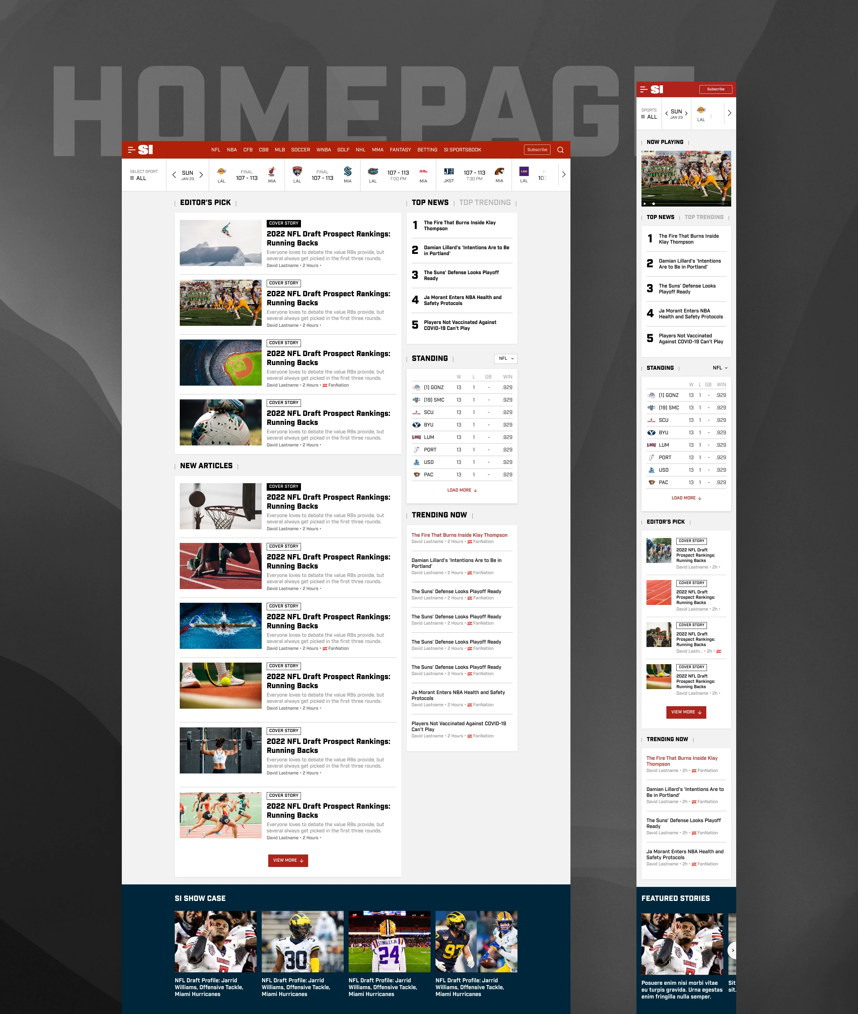
Content Stream Template
Both templates, despite their differing focuses, are constructed with modular widgets and blocks. This design choice ensures adaptability. Be it a significant global sports event or a regular news day, the templates can be adjusted and tailored to the need of the hour, ensuring the SI web always presents its best face forward.
Article Page and Special Edition Design
At the epicenter of user engagement lies the design and interactivity of foundational components. Our revamped Article Page has been meticulously redesigned to offer an enriched reading experience, streamlining content consumption for our users. The Hero Section Module, with its dynamic presentation, ensures that users are captivated right from the outset, setting the stage for deeper engagement.
The Special Gallery Widget elevates this experience further. Beyond its evident visual appeal, it is structured to allow users effortless navigation through carefully curated content.
The Recommendation Widget has been revitalized through a transformative redesign. Now, more than ever, it functions as a dynamic tool in content presentation. While its intuitive nature ensures content is curated to align with individual user preferences, offering a personalized content discovery experience, it also provides editors with the flexibility to showcase tailored recommendations or present a fixed series of stories. This dual functionality ensures both editorial direction and user relevance are harmoniously balanced.
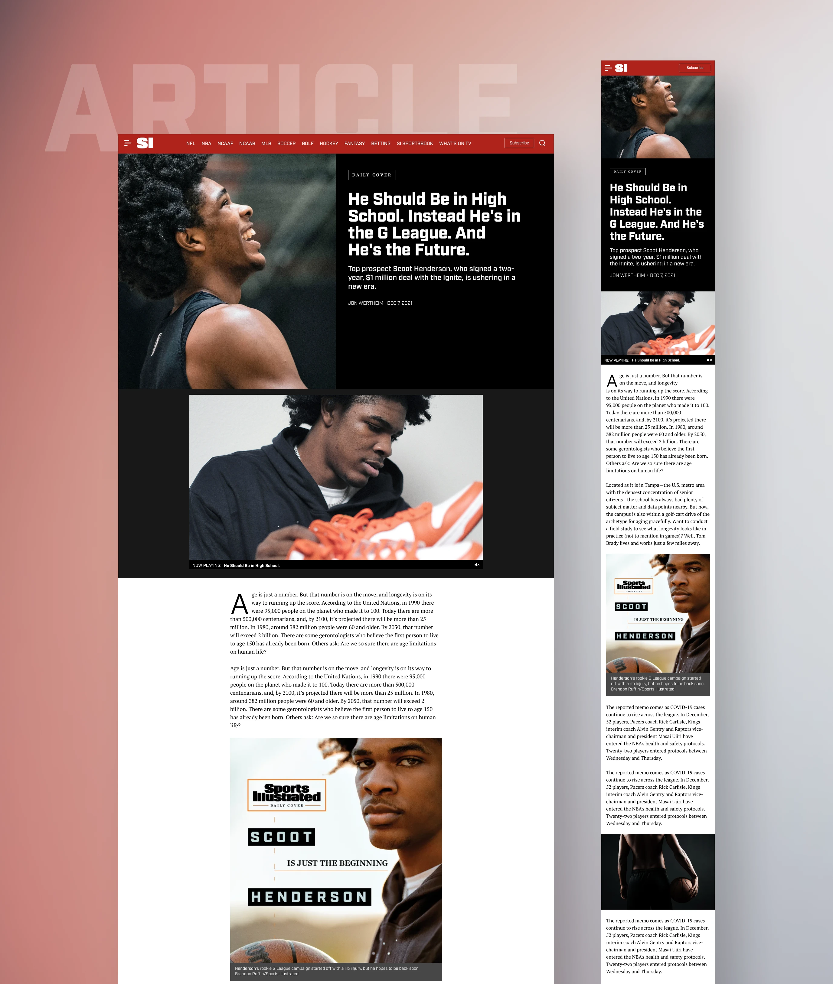
Article template 1/2
However, the pièce de résistance is undeniably the Special Edition article design. This isn't just about exclusivity; it's about versatility. While it showcases an assembly of all possible widgets, making it perfect for comprehensive coverage during special events or features, its modular nature means these components can be seamlessly adapted for general articles. The beauty of this design approach is twofold: while the special editions can utilize all these intricately crafted components to provide a premium experience, general articles too can benefit from this pool of design elements, ensuring a consistent, high-quality user experience across the board.
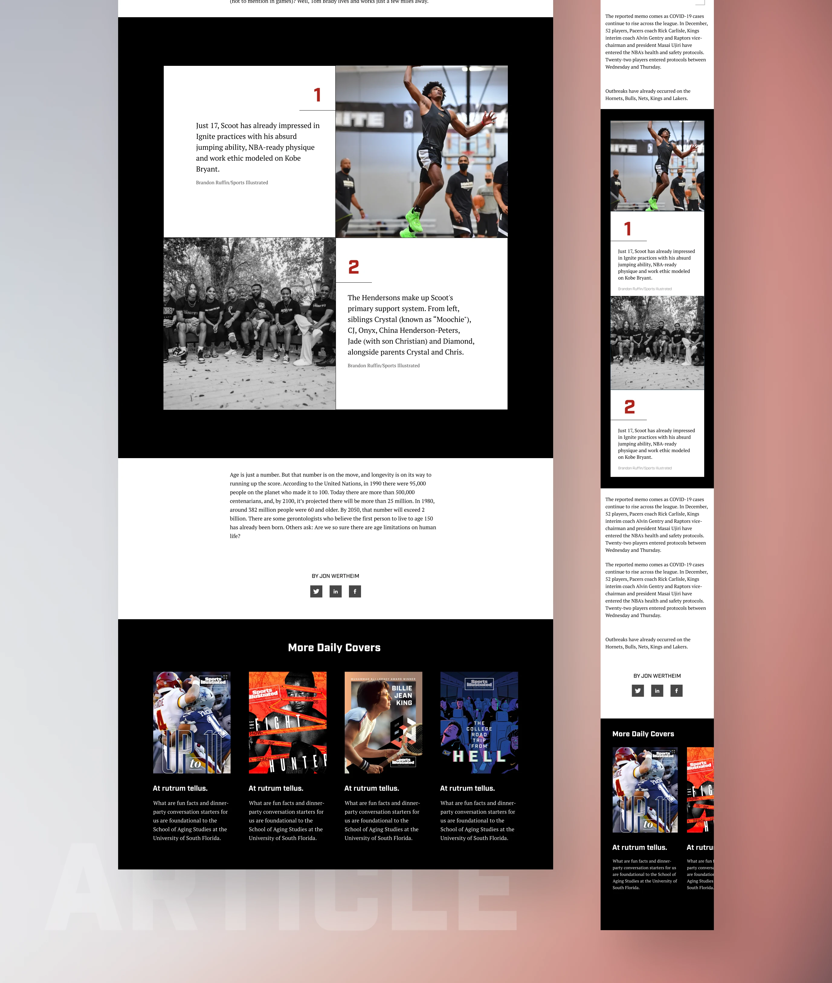
Article template 2/2
Daily Cover Home
In the vast ocean of content, the Daily Covers stand out as monumental beacons, highlighting the most impactful stories of the day. Recognizing their significance, we introduced the Daily Cover Homepage—a centralized hub designed exclusively for the discoverability and showcase of these pivotal narratives. This dedicated space not only celebrates the depth and artistry of each cover story but also provides users with an organized platform to explore the richness of past covers, ensuring that every impactful narrative gets its moment in the spotlight.
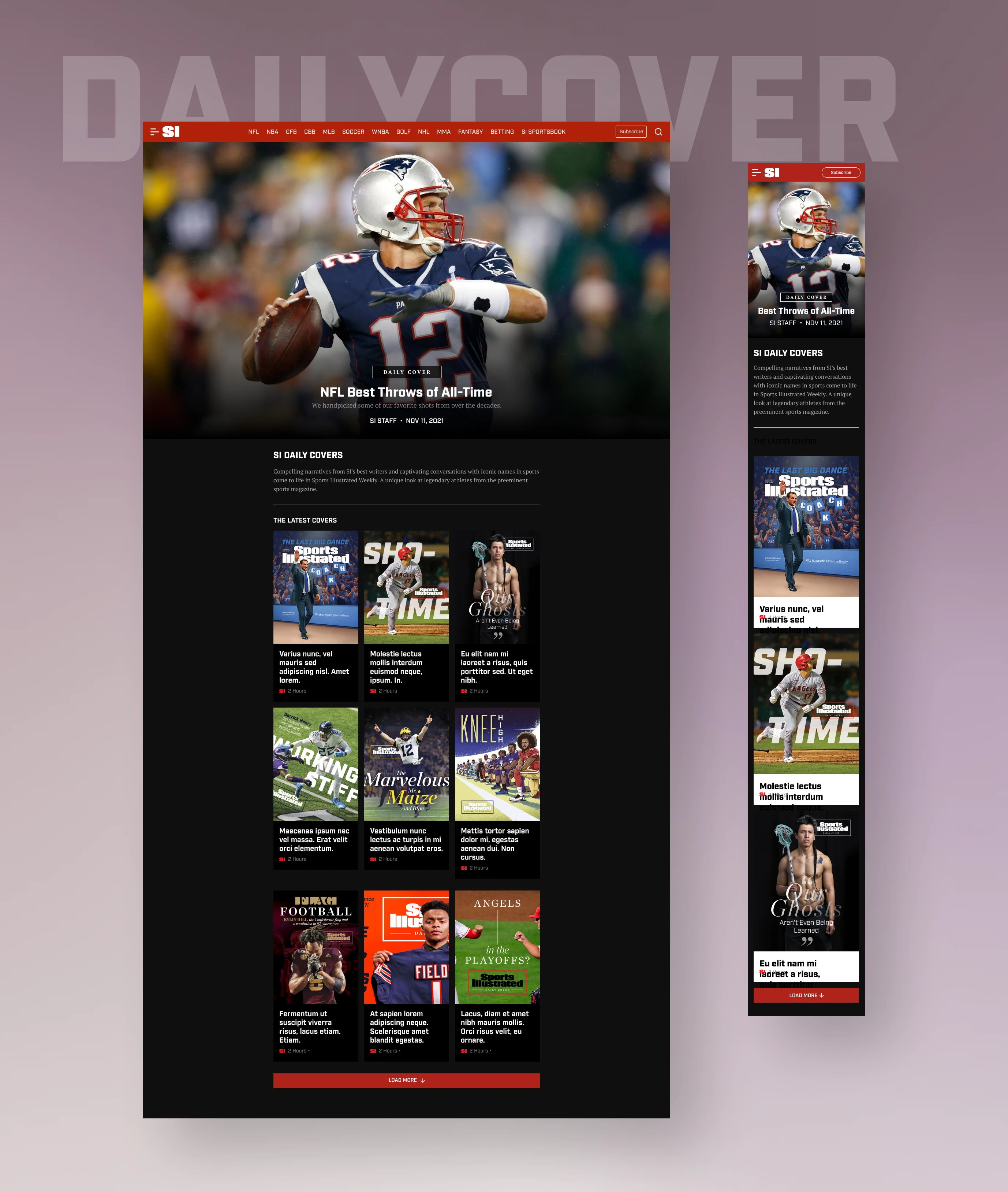
Daily Cover Home/Hub
Podcast Page
Audio content has surged in popularity, and with the Podcast Page, we aimed to craft a space exclusively tailored for this medium. The goal was simple yet profound: ensure ease of use while optimizing listener engagement. The redesigned page now serves as a seamless platform, where listeners can dive deep into their favorite sports narratives.
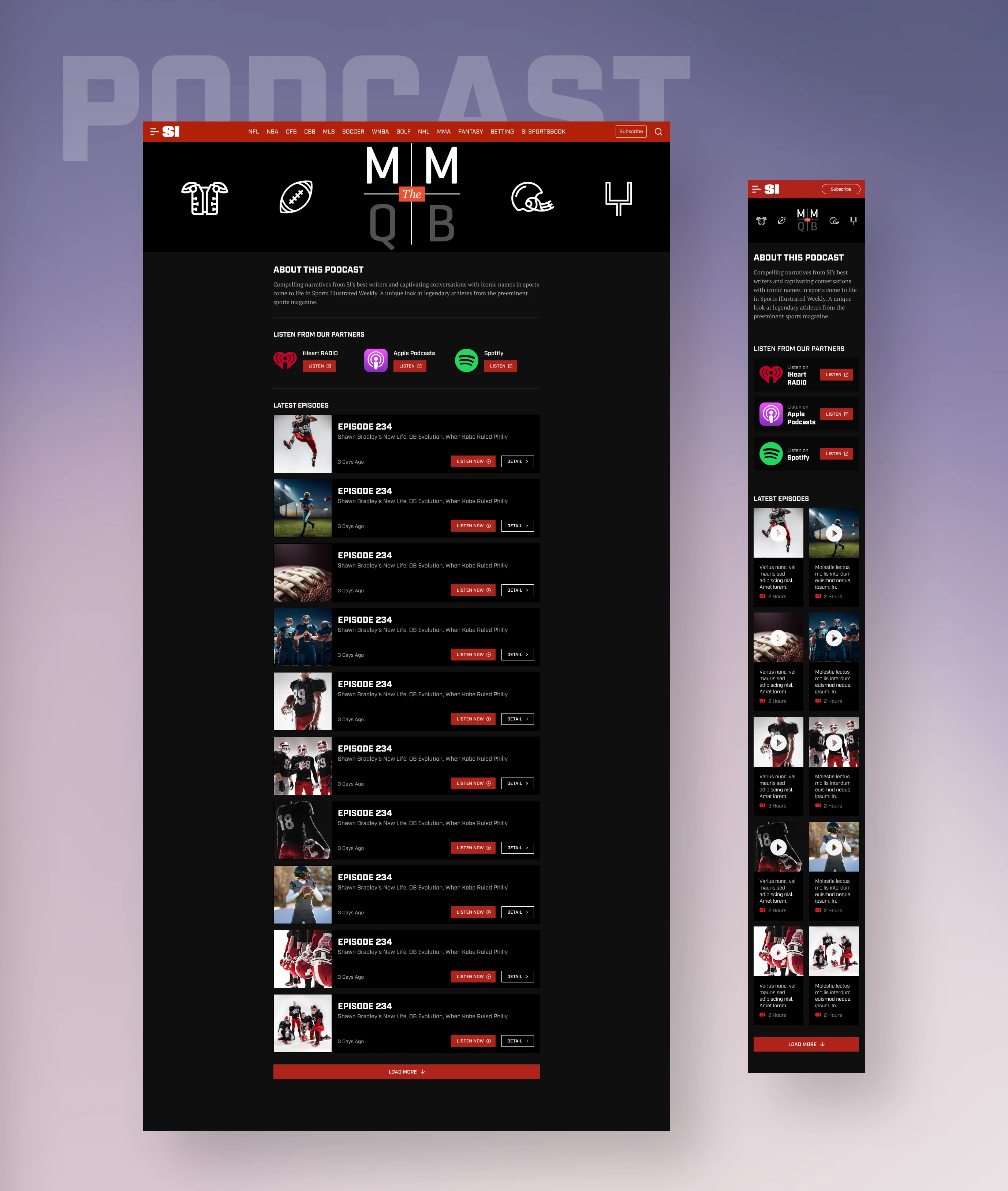
Podcast Page Template
Additional Tasks and Mockups
Beyond the primary redesign, my involvement extended to other critical tasks. This includes the User Email & Notification Preference—a feature that ensures users remain connected and updated as per their preferences. The account setting ensures personalization, and the Newsletter Subscription Center was revamped to provide a seamless experience for users wishing to stay abreast of the latest from Sports Illustrated.
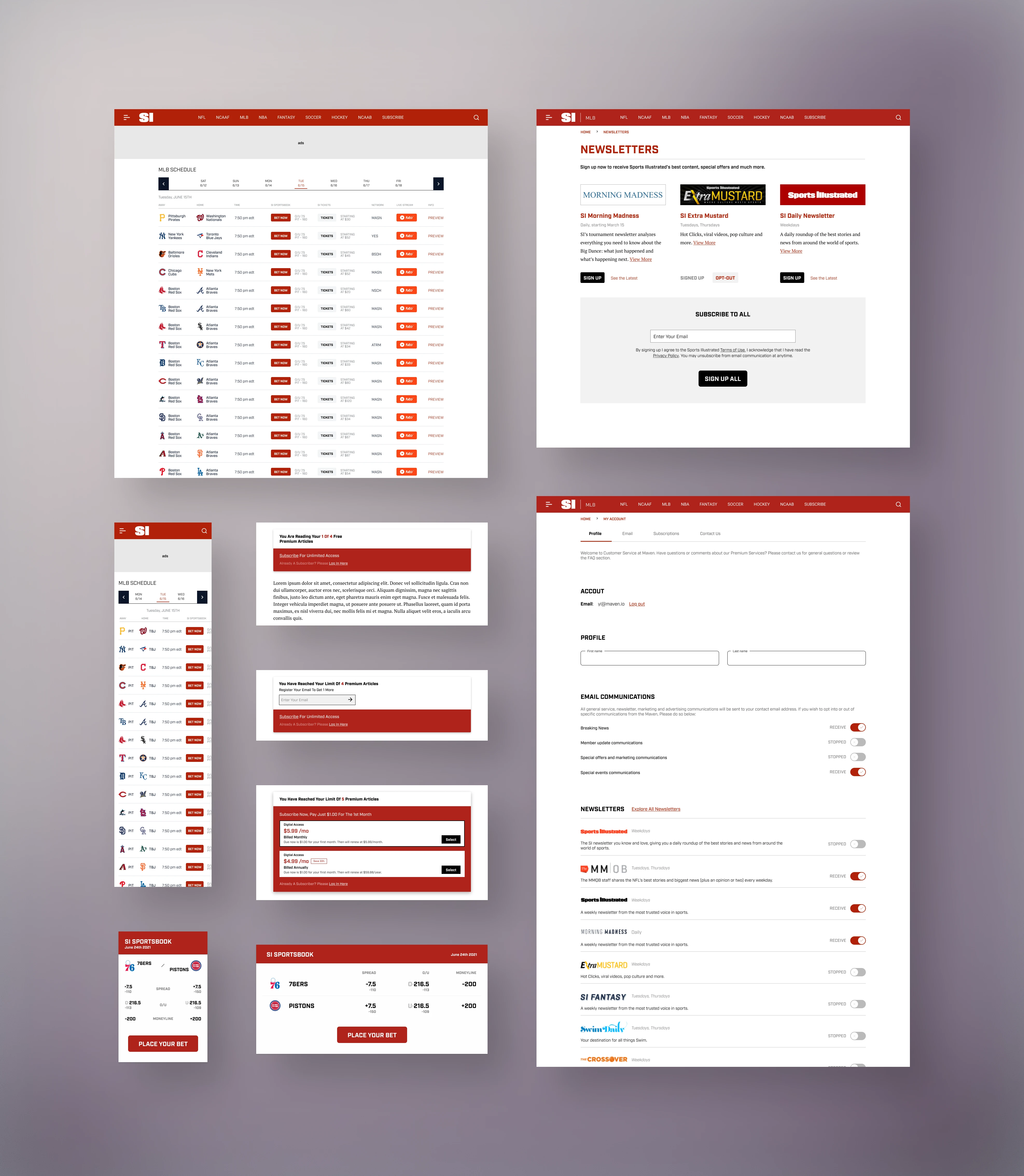
Additional Pages, Widgets, Tasks and Components
Design System
Cornerstone of Consistency: The Design System
To establish a unified design language across the SI web experience, a robust design system was developed. This system, more than just a collection of assets, was the embodiment of consistency, efficiency, and shared understanding. It served as the go-to reference for both new and seasoned designers, ensuring that every design decision—whether it be typography, color palettes, or UI components—aligned with the overarching vision for the SI web experience.
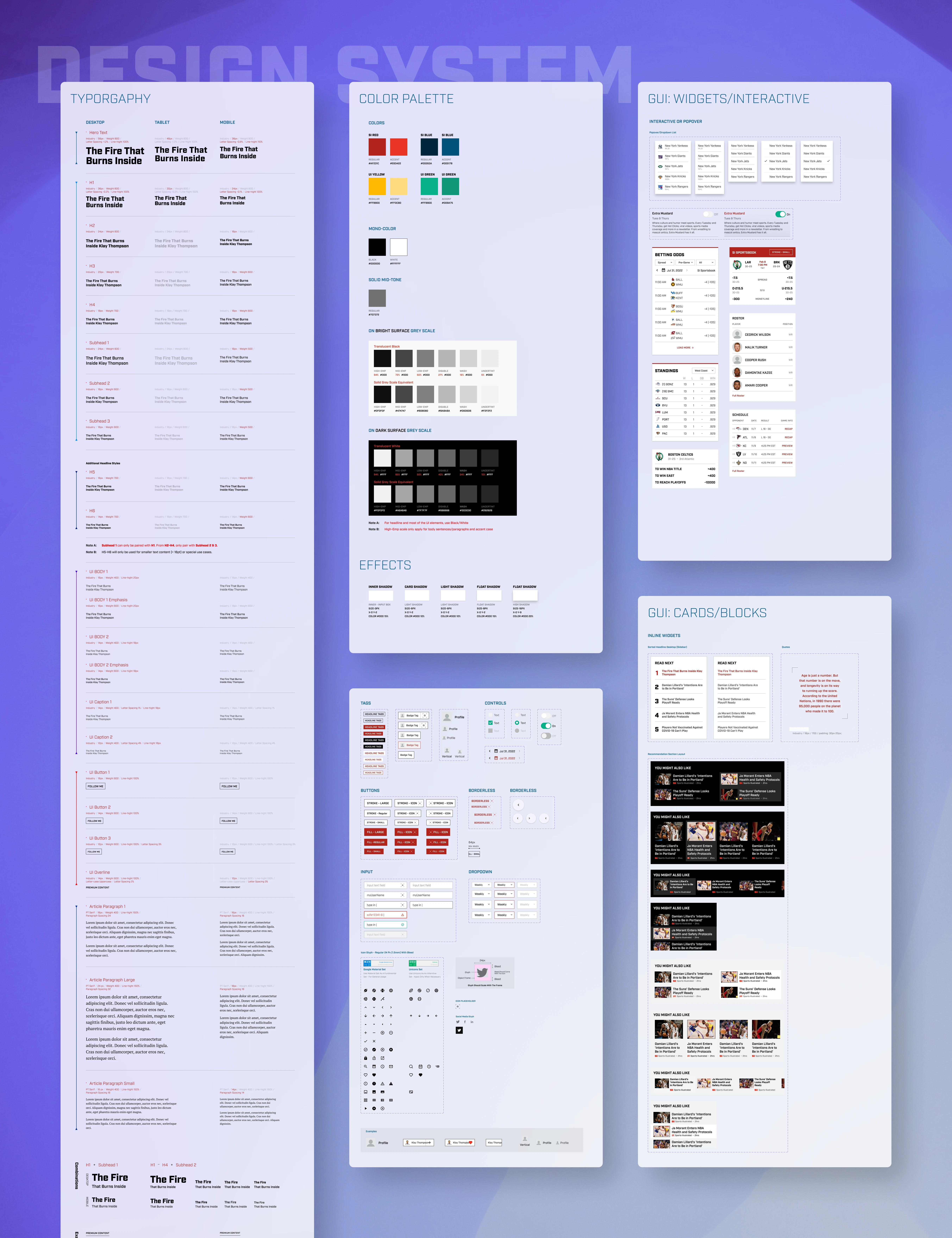
Design System
Bridging the Gap with Developers: Figma Inspection Guide
Collaboration between design and development teams is pivotal for a seamless transition from mockups to live products. To bolster this synergy, a Figma Inspection Guide was conducted. This initiative was more than just a walkthrough—it was an opportunity for designers to shed light on the intricacies of their designs, and for developers to gain a deeper understanding of the design's intent, structure, and details. It served as a proactive step to mitigate any potential misunderstandings or gaps, ensuring that the developed product was a true reflection of the design vision.
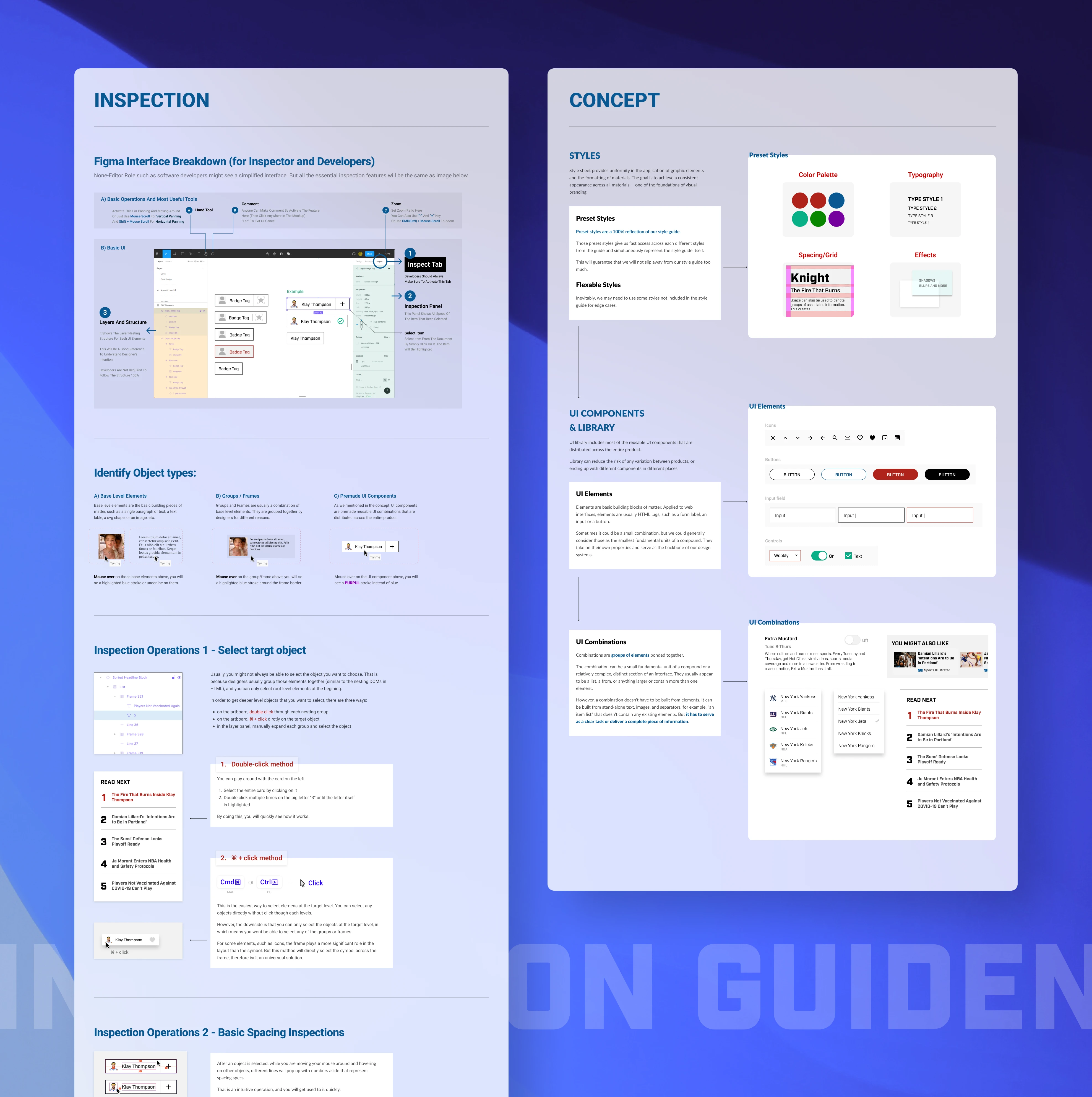
Figma Inspection Guidence for Developers
Insights & Learnings
**Iterative Evolution Over Time**
In a prolonged project like the SI web enhancement, the key is not just about delivering results but about refining them over time. Continuous user feedback and periodic design evaluations ensured that the site always aligned with evolving user needs.
**The Value of Consistency**
While working on multiple sub-projects, it became evident how vital a unified design language is. Consistency is not just about aesthetics; it ensures that users don’t need to relearn their way around new features, providing a seamless user experience.
**Collaborative Synergy**
Regular interactions with developers, product managers, and other designers enriched the design process. It's not just about achieving a shared vision but about combining varied expertise to reach innovative solutions.
**Understanding Users in Depth**
The extensive timeframe provided an opportunity to truly understand the SI web users. Patterns emerged, preferences evolved, and the design adapted, ensuring a user-centric approach at all times.