Polywell
Rebranding for a New Era
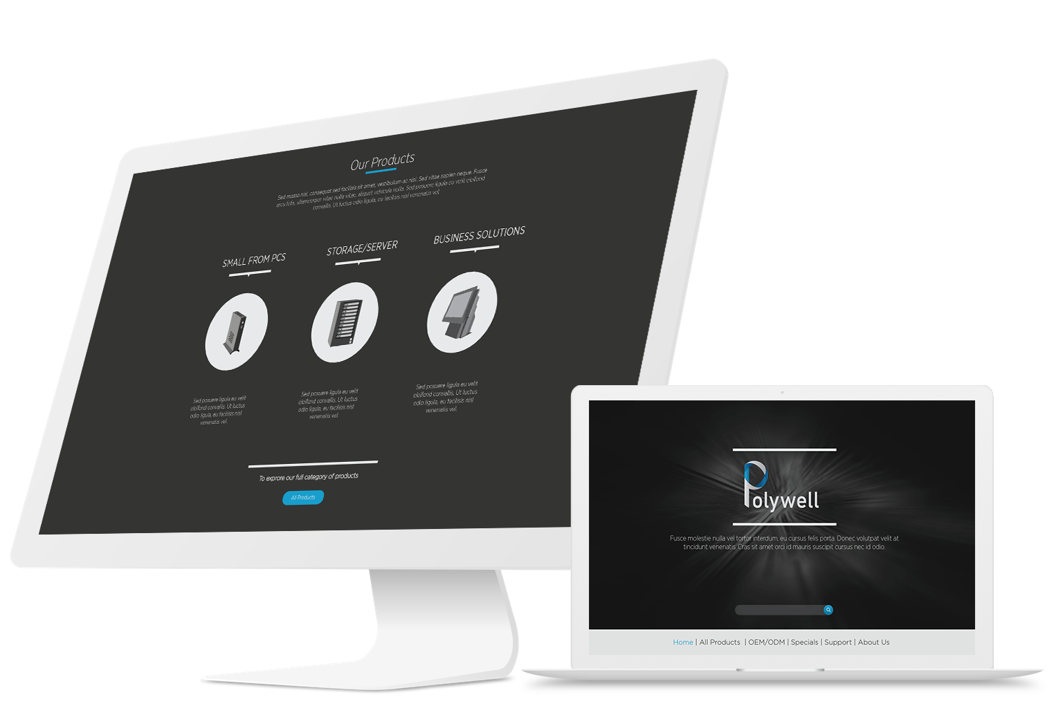
Background
Company Overview
Polywell is a South San Francisco-based computer manufacturing company with nearly three decades of industry experience. Specializing in quality computer systems, Polywell caters to both U.S. and international markets.
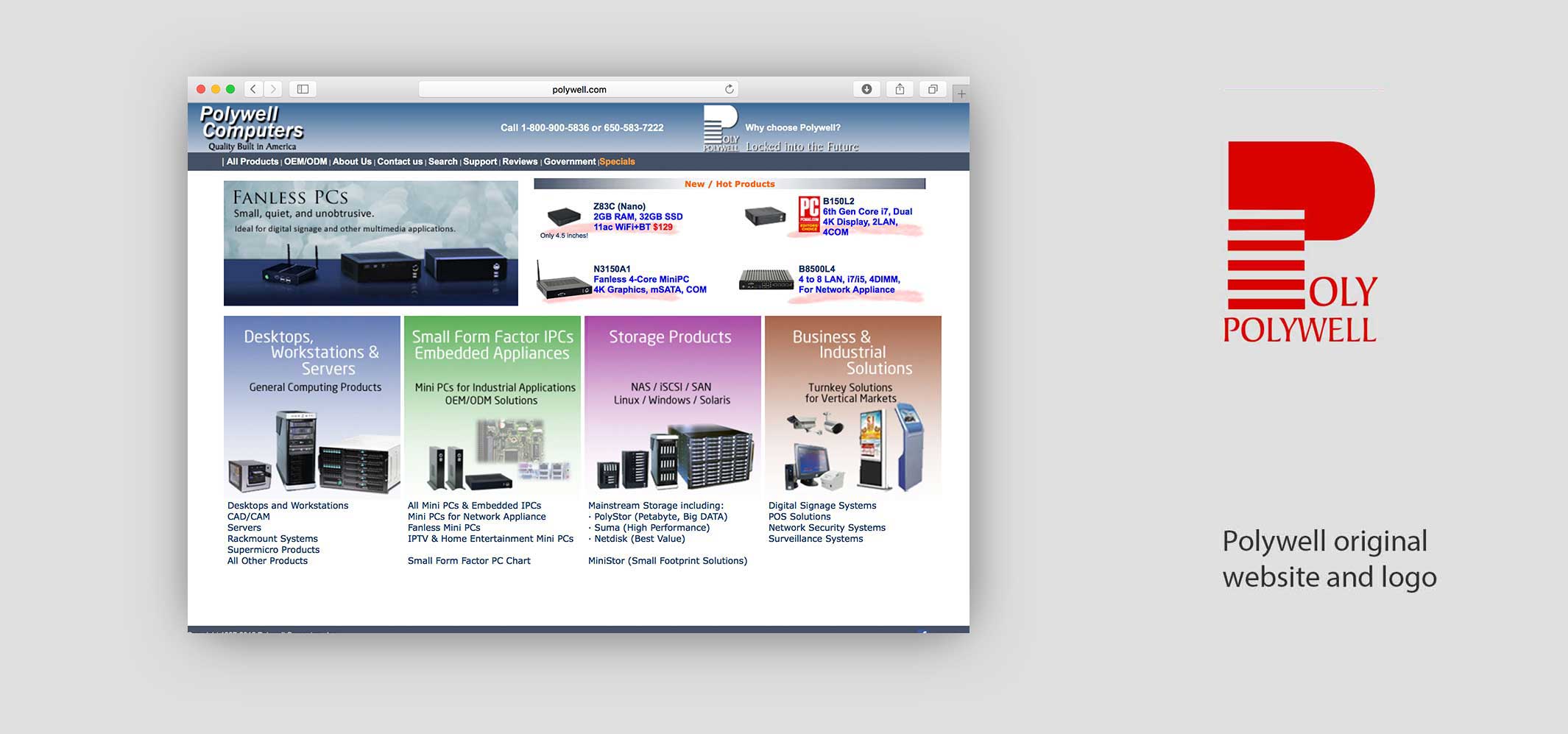
Original Brand Identity
Project
Upon my engagement, Polywell was operating under a logo and website that had remained static for almost 30 years. My role was to breathe new life into these assets, aligning them more closely with the company’s history and present-day culture.
Logo Revision
Historical Context
The original logo sought to emphasize Polywell's U.S. manufacturing roots, using stripes reminiscent of the U.S. flag. However, this symbolism had grown outdated, especially given that even industry giants like Apple no longer manufacture exclusively in the U.S.
Design Choices
In redesigning the logo, I selected DIN Schrift as the typeface for its strong association with technology and industry. I also modernized the letter 'P' to resonate more closely with contemporary design aesthetics and industry relevance.
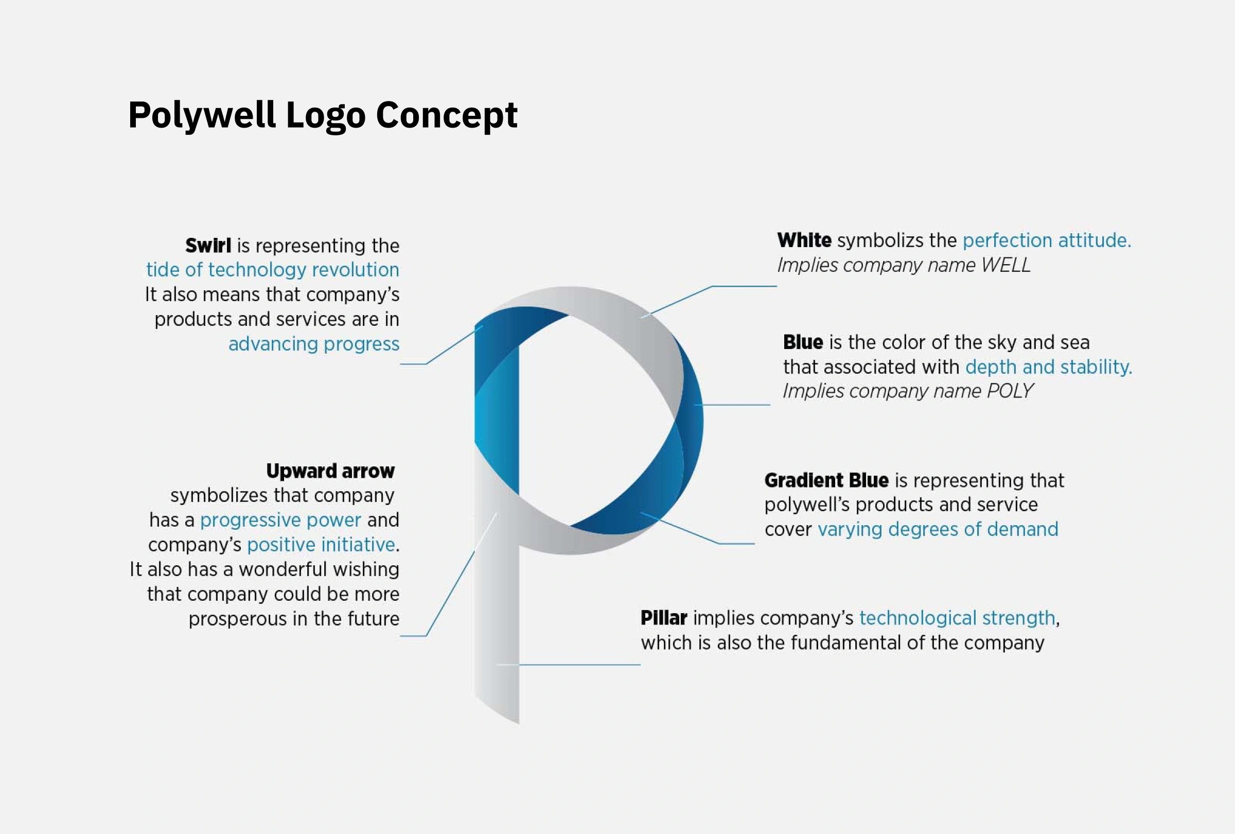
New Logo Concept
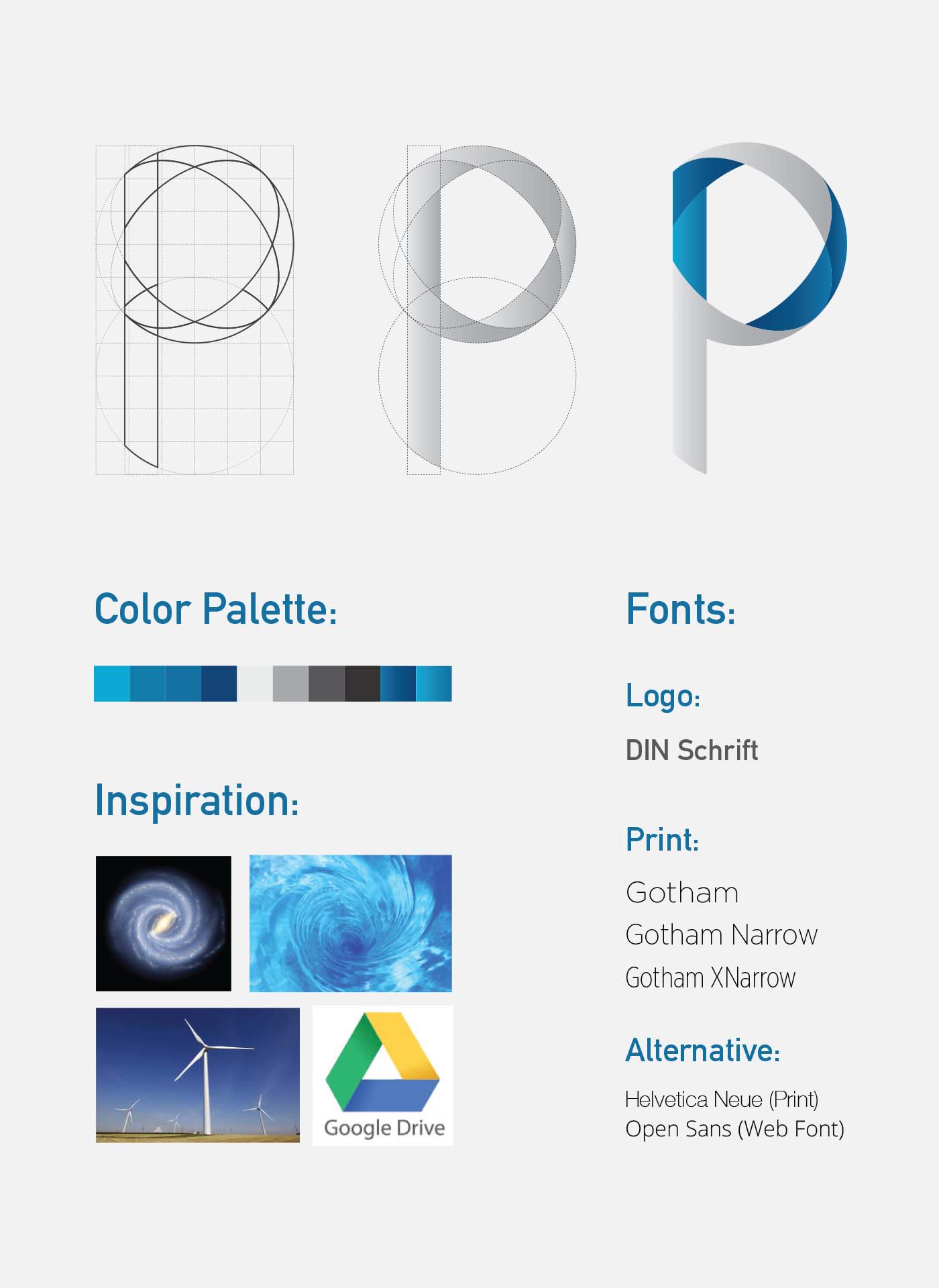
Branding Guide
Applications
Other Design Contributions
During my tenure with Polywell, I served as a Graphic and Web Designer. Beyond the rebranding initiative, my responsibilities extended to designing an array of marketing materials such as posters, brochures, flyers, and trade show booths. I also occasionally took charge of product photography and web-based assets like banners.
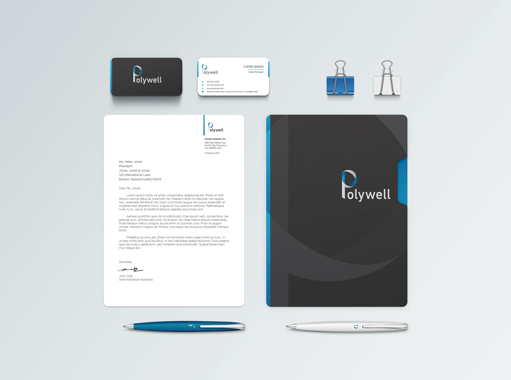
Stationery
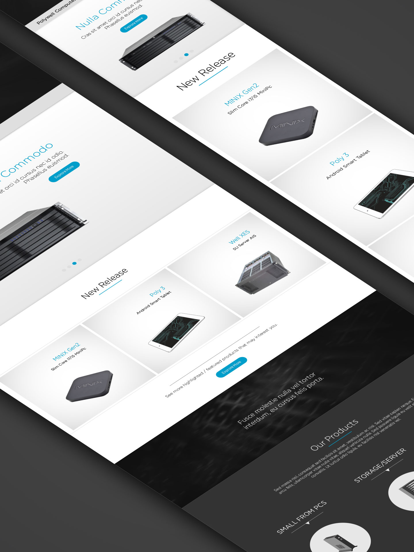
New Site Concept
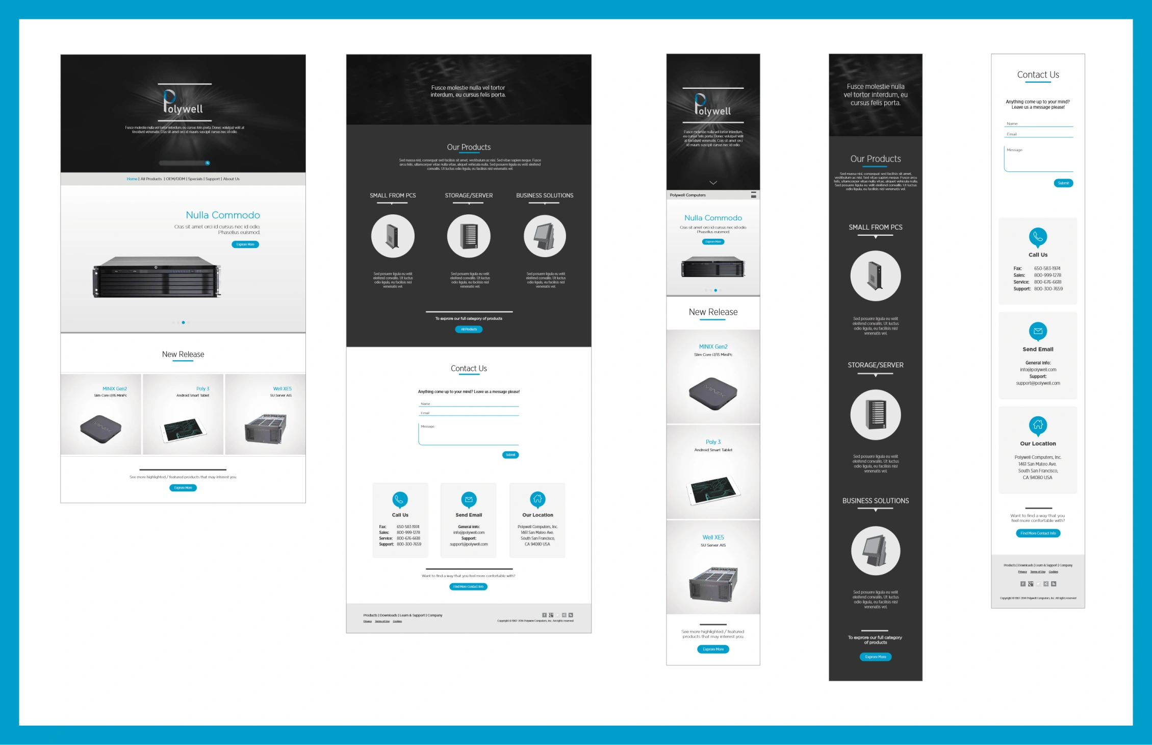
Mobile & Desktop Web
Learning Moments
This project underscored the importance of aligning a company's visual identity with its evolving market position. It offered a condensed lesson in balancing historical identity with contemporary demands, and thereby reinforced my belief in the adaptability and ever-changing nature of branding.