LinCo
Bridging the Gap in English Communication
Background
Language and Trade
China predominantly measures educational achievement through written exams. This approach, although comprehensive in many areas, often leaves students bereft of effective communication skills. Parallelly, with the Chinese economy's dependence on overseas trade, the demand for fluent oral English communication is ever-increasing. This backdrop underscores the immense potential of the oral English education market in China.
About LinCo
LinCo stands at the forefront of addressing this gap. As a startup, it offers specialized online English education services, propelling Chinese students to achieve improved oral communication skills.

My Role and Early Impact
Upon my initial engagement with LinCo as a UX Designer for their web client, my scope rapidly expanded, thanks in large part to a decisive moment early in my tenure. During a critical meeting, where myriad opinions clouded the true issues at hand, I sensed the urgency to steer the conversation towards actionable insights. Employing whiteboard problem-solving methodologies, I facilitated a workshop that brought clarity and alignment among all stakeholders, including the CEO. This not only cemented my role within the team but also expanded my responsibilities to spearhead the rebranding initiative, oversee the redesign of the company website, and curate presentation keynotes and promotional materials. The impact of this pivotal moment had a domino effect, setting the project on a more focused path and strengthening the team's collaborative dynamics.
Logo & Branding
The Golden Tie
**Original Logo:**
LinCo's emblem, a golden tie, symbolized professionalism, aligning with the pronunciation of “lingdai” in Chinese, reminiscent of the company’s name, "LinCo".

Old LinCo Logo
**Research:**
An internal survey coupled with user interviews elucidated several insights:
- The tie emerged as a powerful visual identifier, evoking professionalism and formal occasions.
- However, its connection with education was tenuous.
- The design intricacies, including the negative lines and the circle on the knot, misdirected its perception, making it resemble a keychain.
- The gold hue stirred mixed feelings. While Chinese users harbored an innate affinity for it, US educators couldn't correlate it with academia.
**Design:**
Incorporating these findings, I commenced with paper sketches. After iterative discussions, the final design retained the tie motif and the gold color to preserve brand recognition.
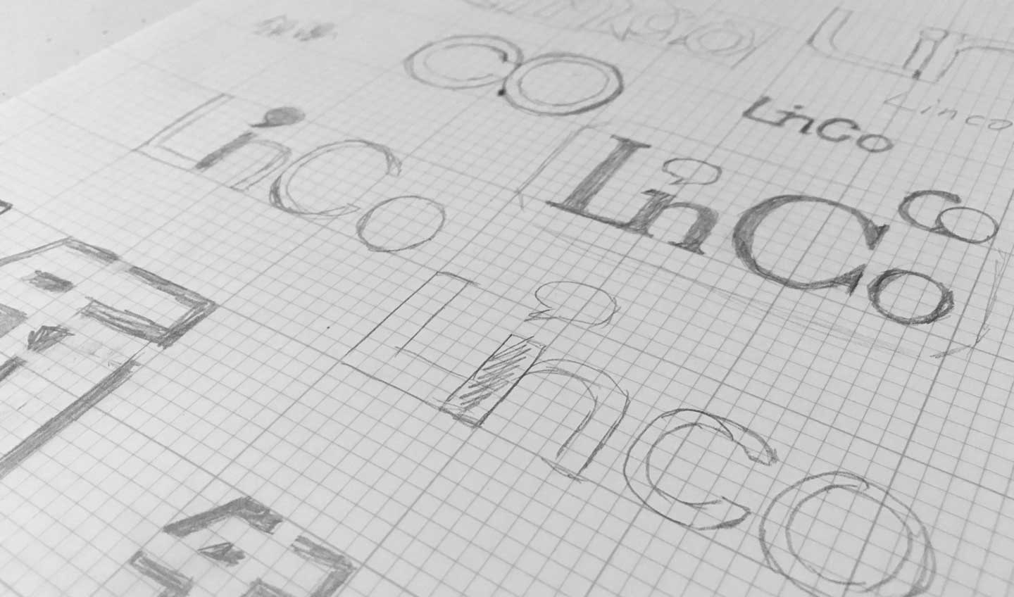
Sketchs and concepts
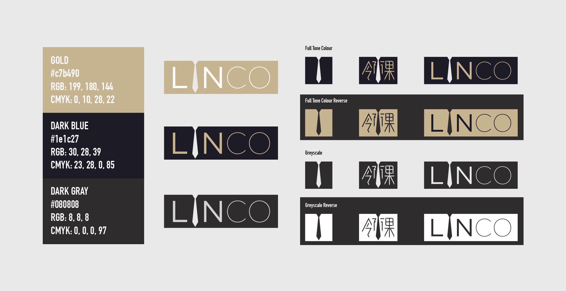
Final logo design
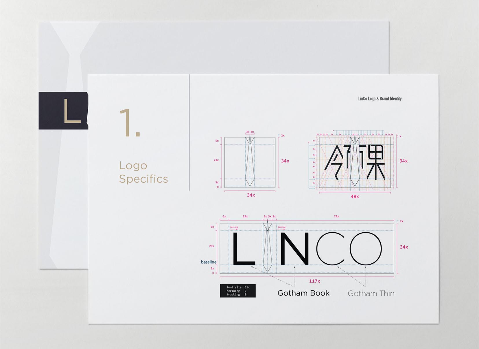
Branding Guidelines
**Applications:**
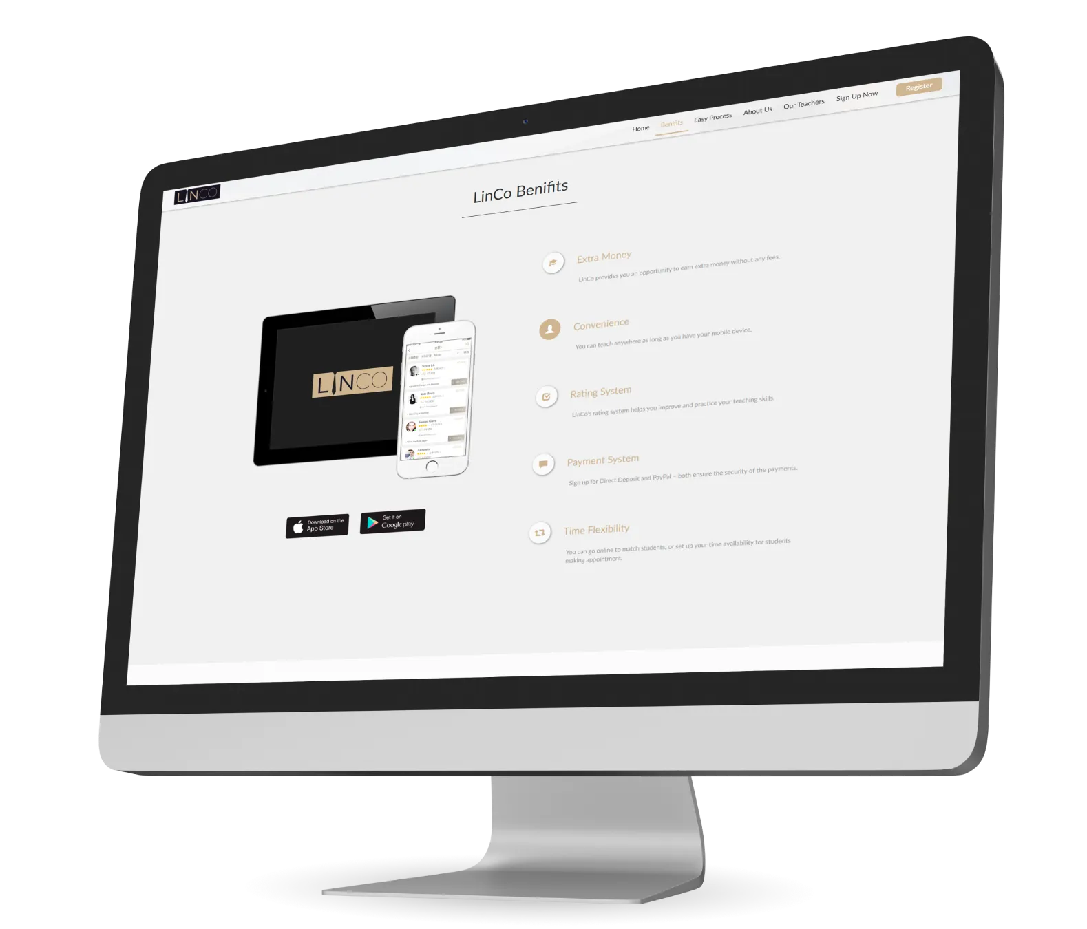
I extended the refined branding across various touchpoints including stationery and the company's website, for which I not only designed but also executed the coding.
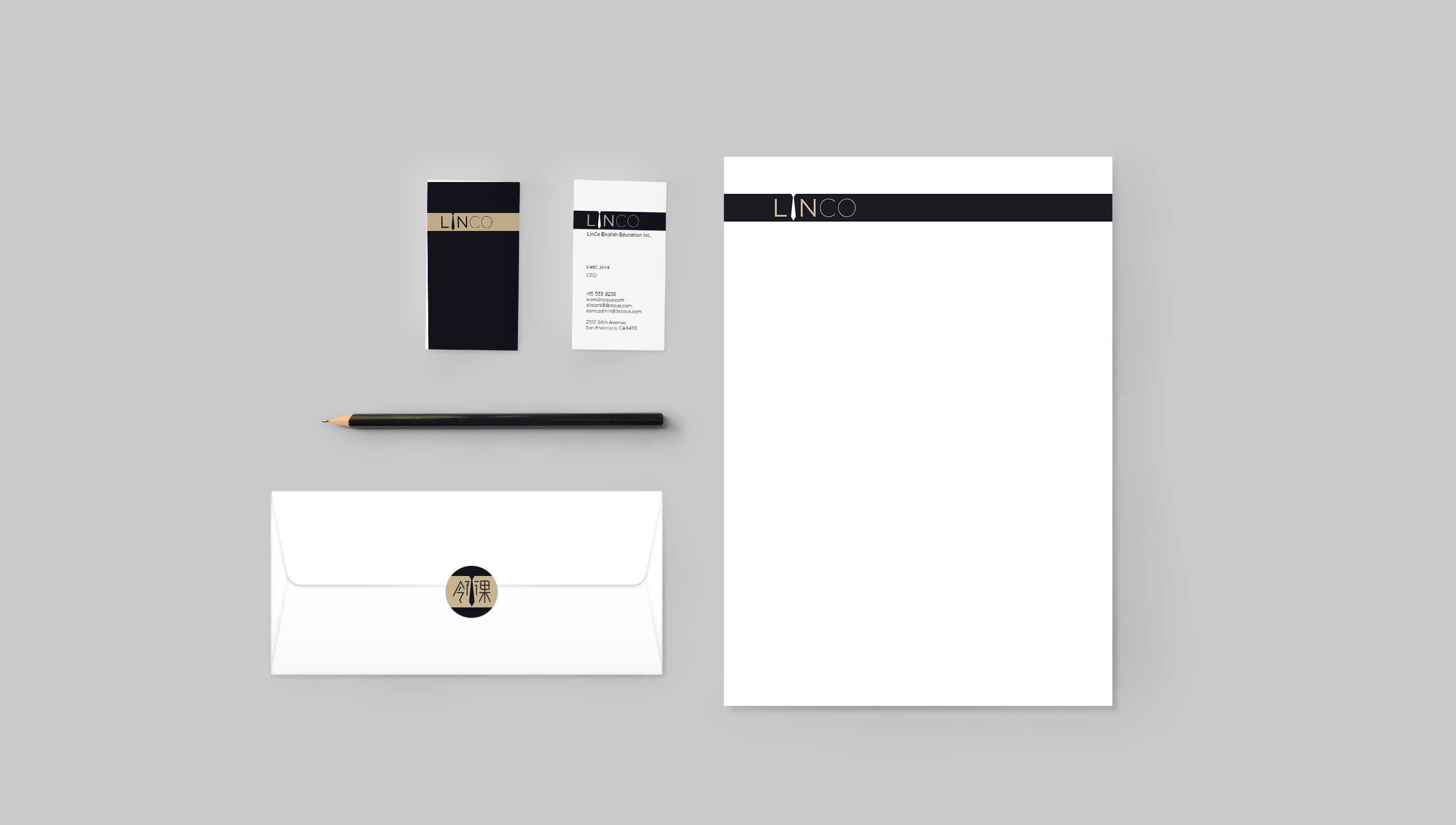
Stationery
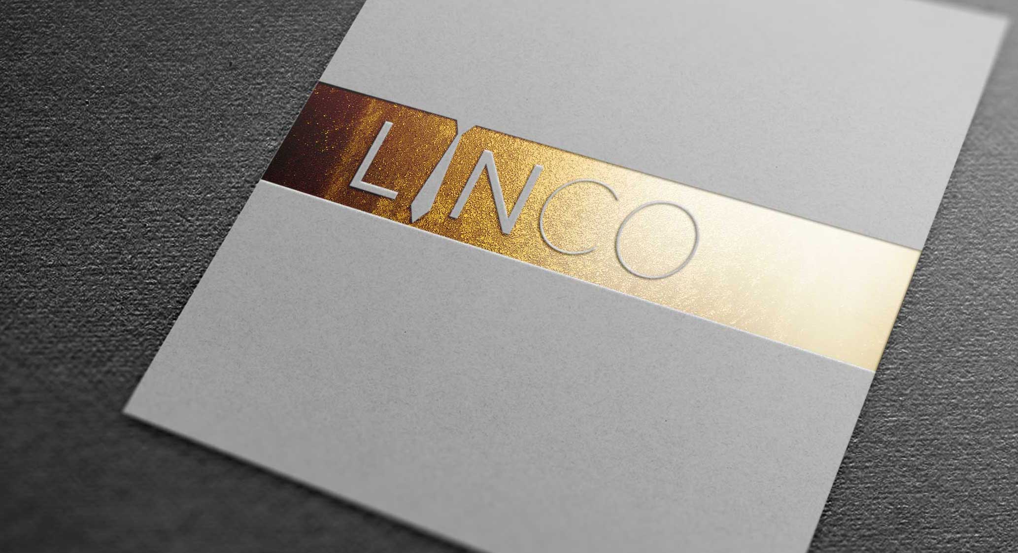
Invitation Card

New Company Website
UX Design
Streamlining Interaction
My primary role was designing the web clients for LinCo teaching systems, catering to both students and teachers. Collaborating in a team of two, my contributions encompassed ideation, research, user-flow mapping, information architecture, and wireframing.
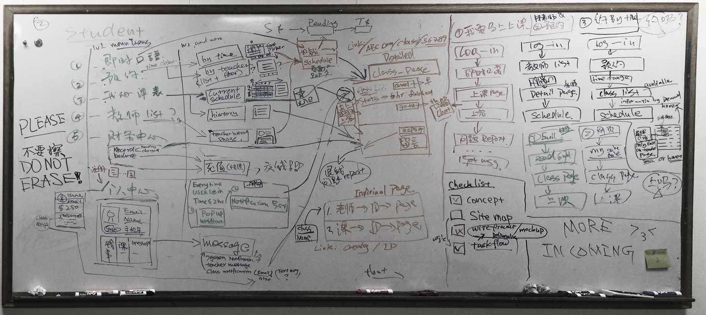
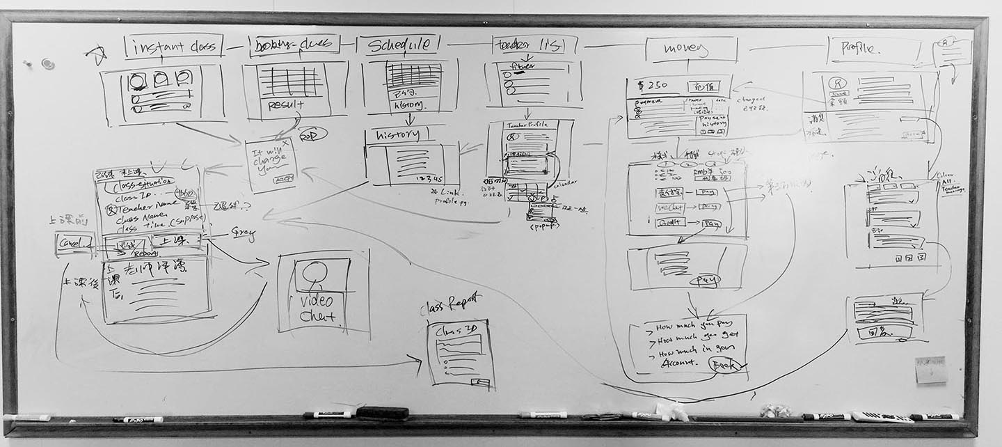
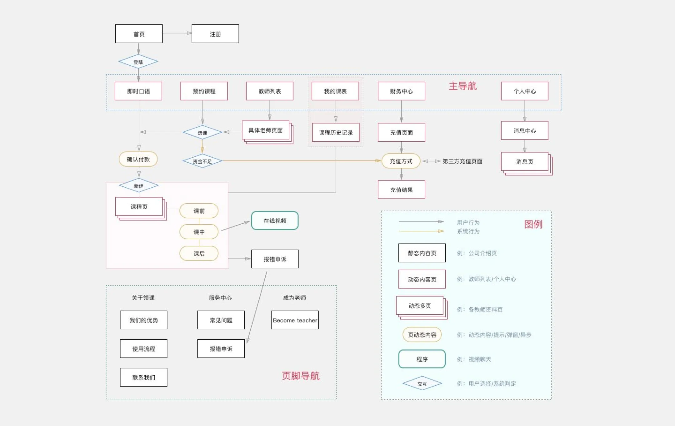
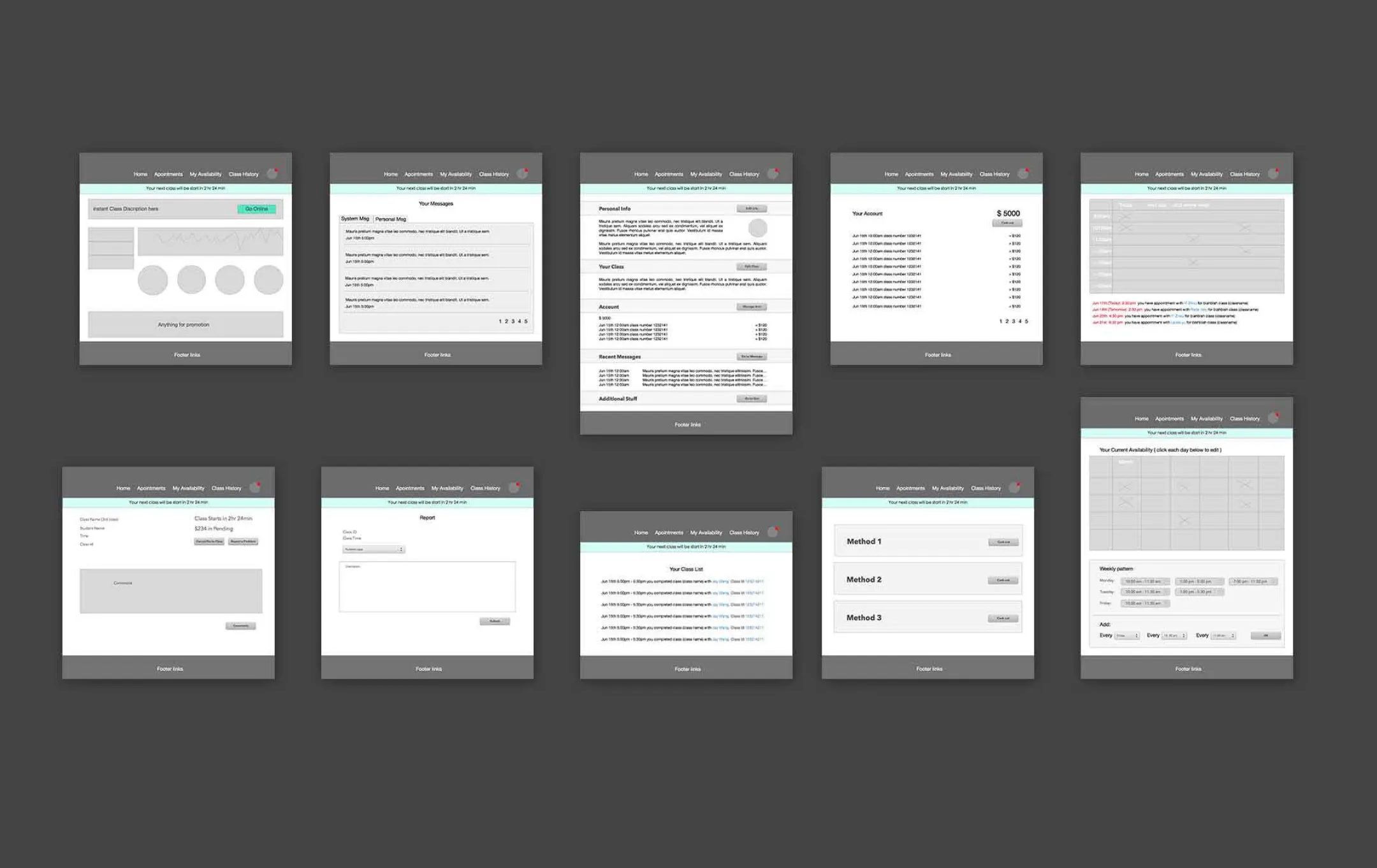
Whiteboard sketching and studies, user flows, wireframes etc.
A Learning Journey
My experience at LinCo was as much about personal growth as it was about professional execution. Recognizing a vacuum in focus and decision-making, I seized the opportunity to take initiative. By stepping up when it was needed most, I was able to drive meaningful change and create impact. This proactive approach not only enhanced the project but also enriched my understanding of the dynamics between design, team collaboration, and leadership. In essence, LinCo served as a proving ground where I learned the invaluable skill of turning challenges into opportunities through initiative and foresight.